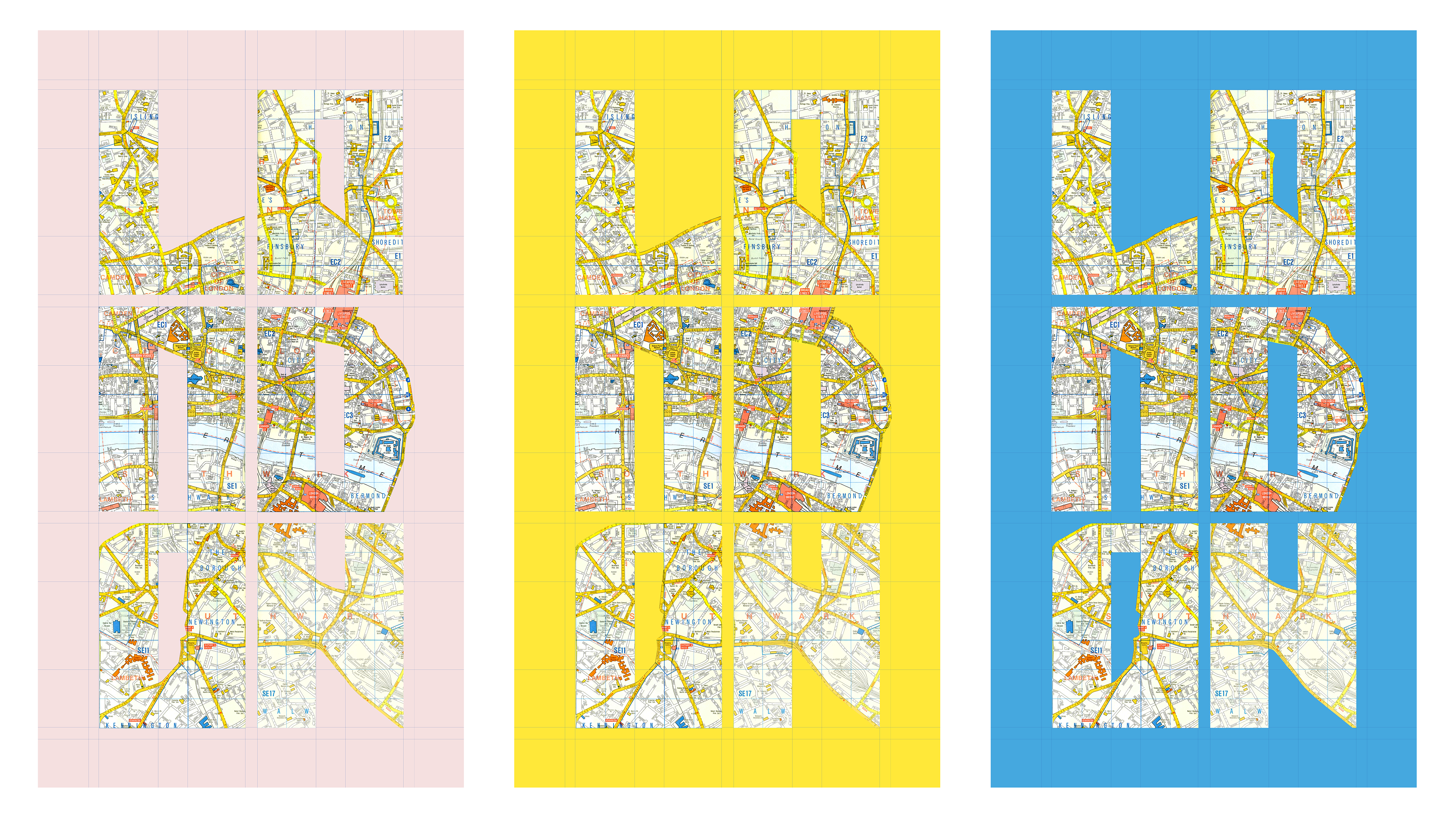
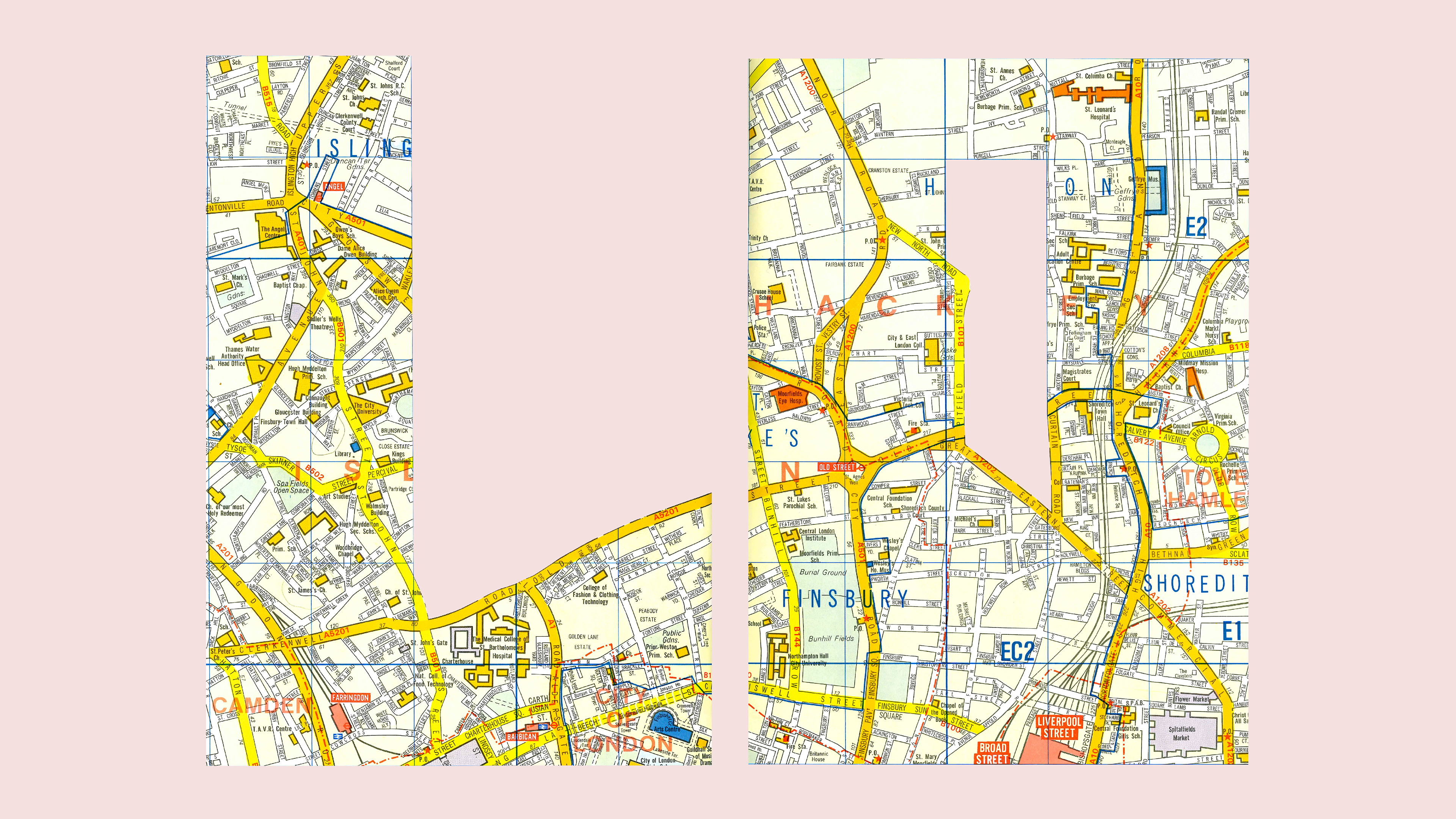
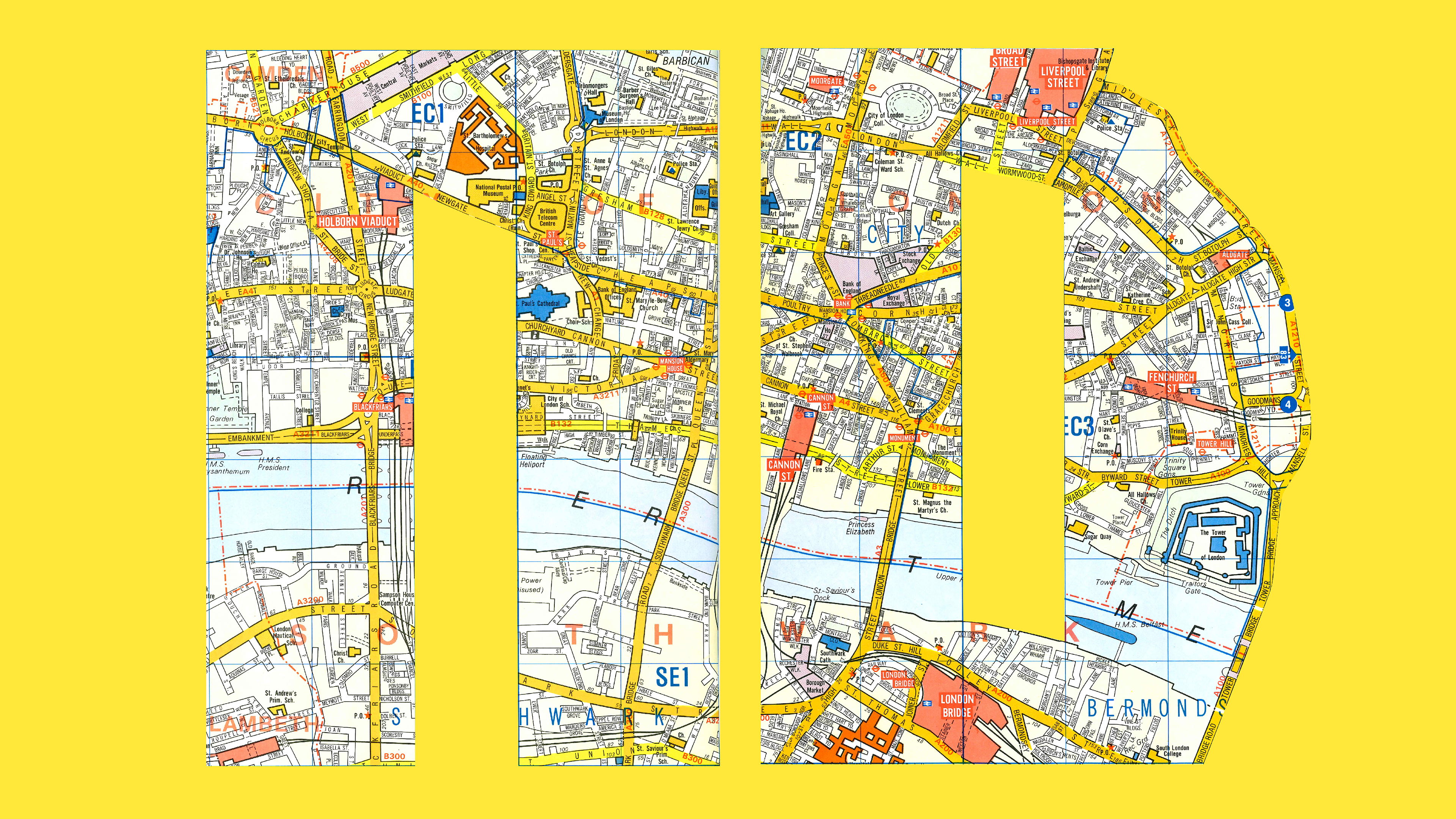
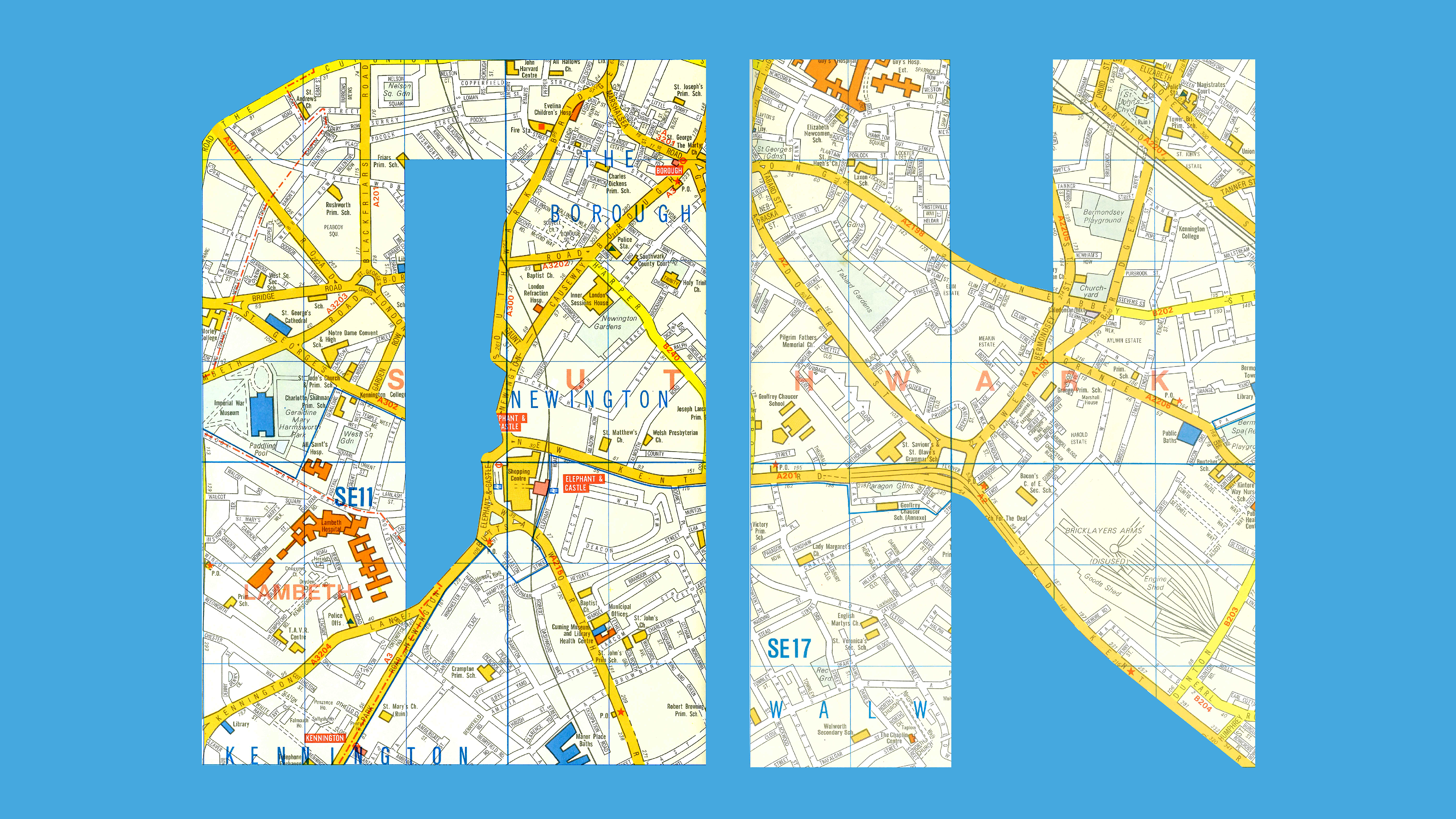
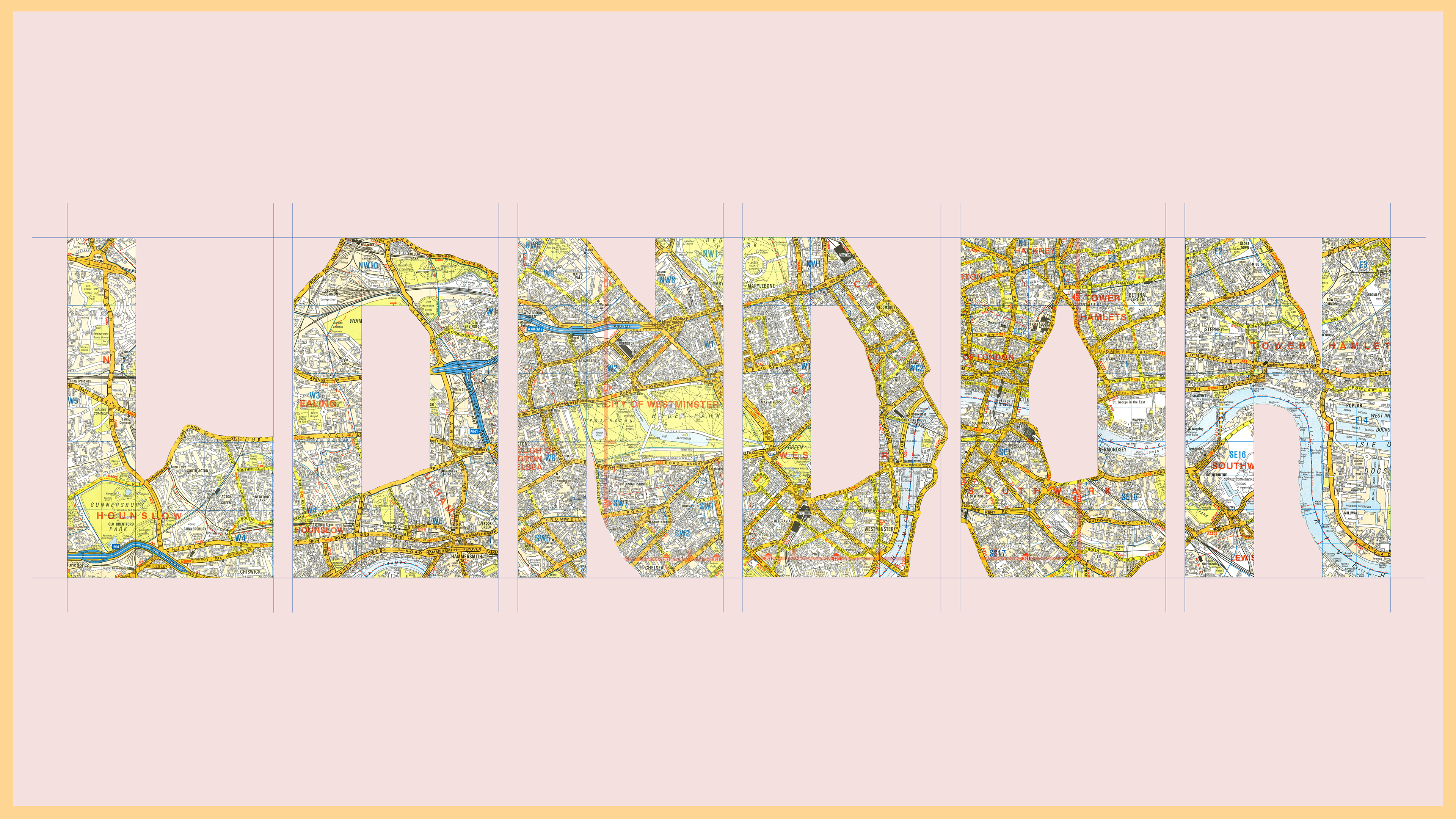
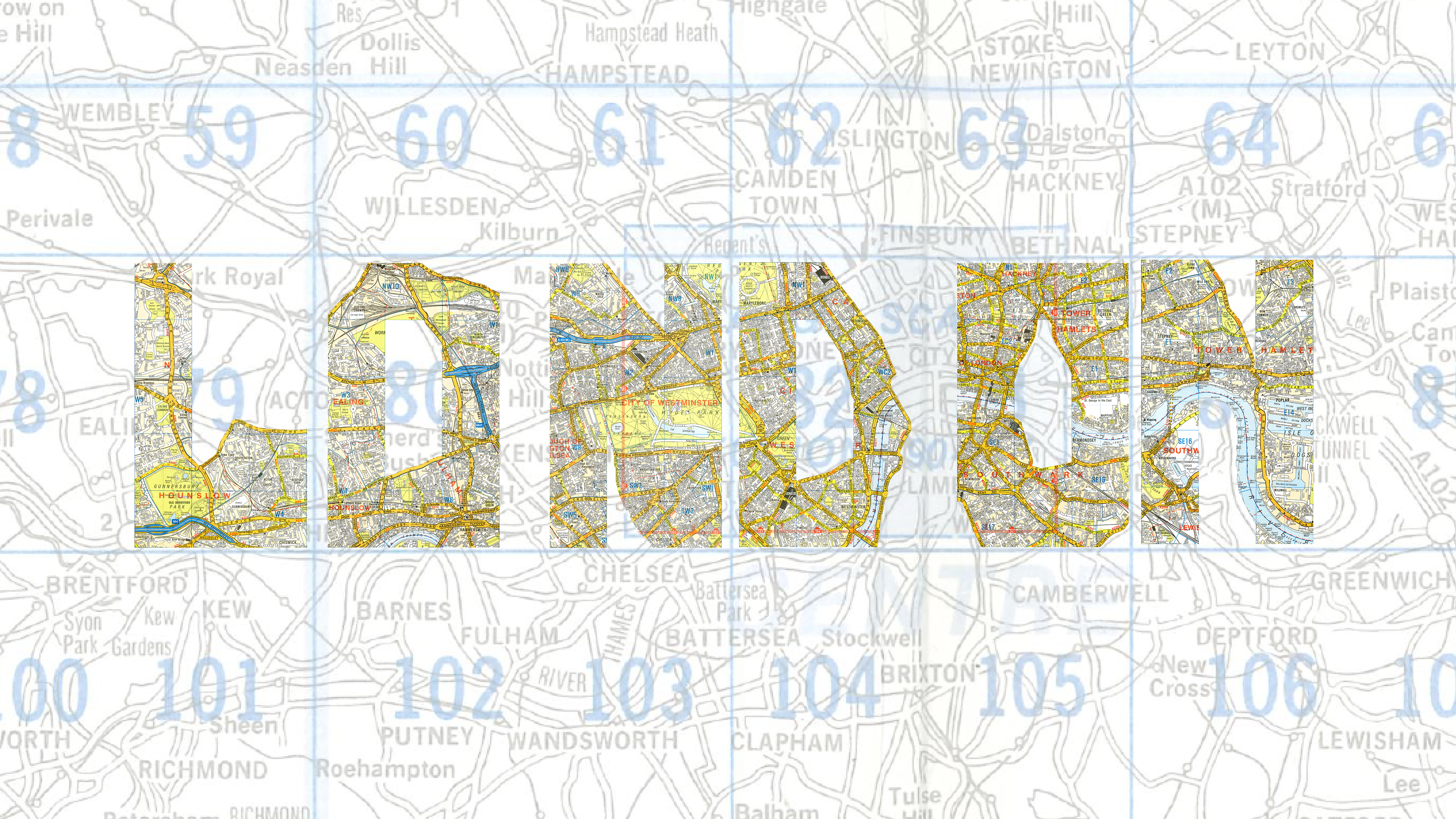
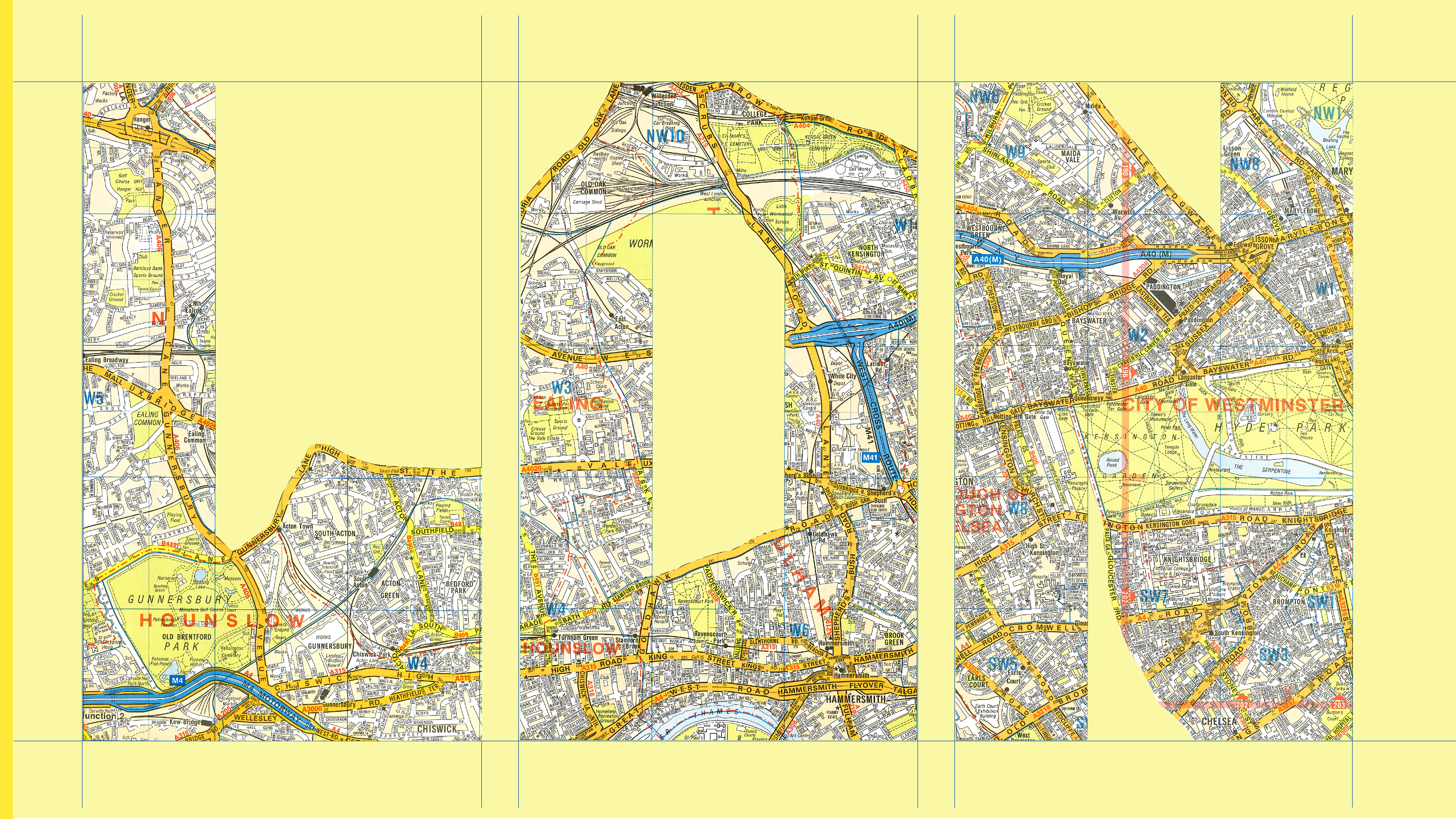
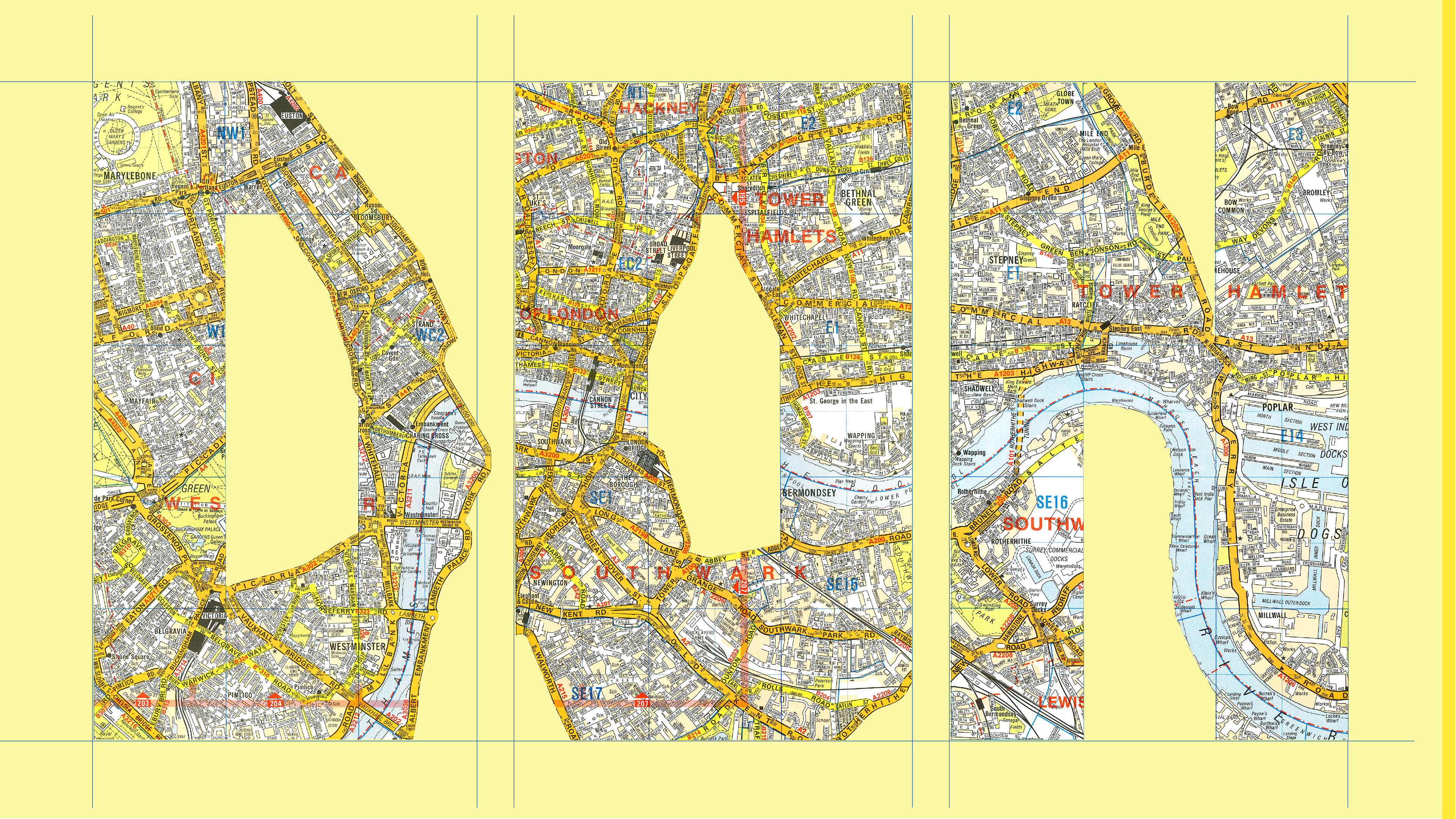
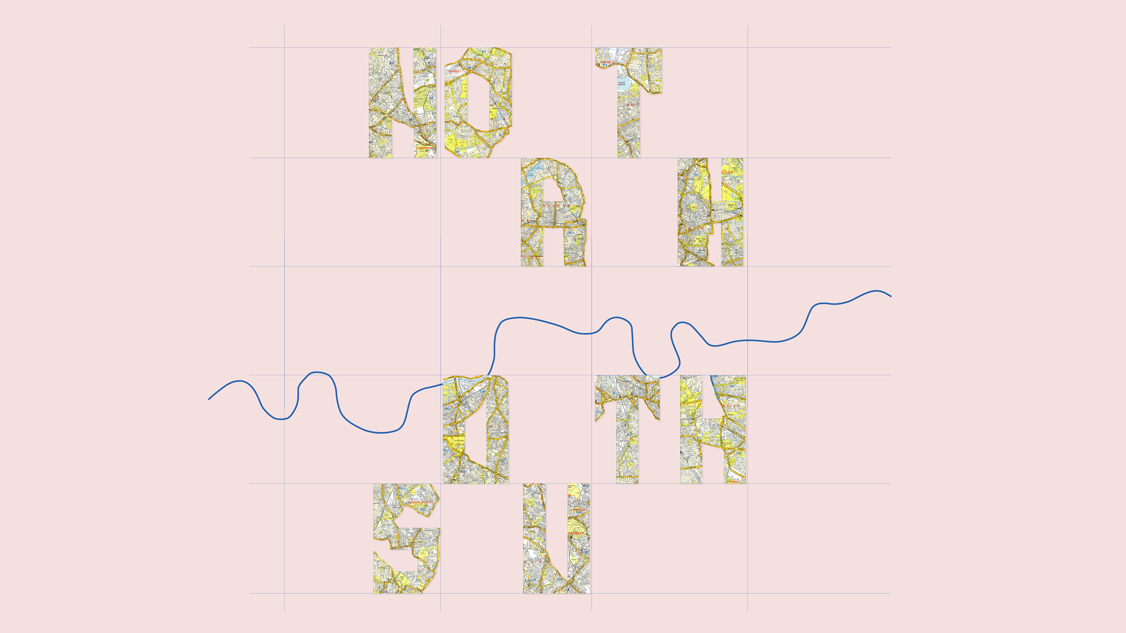
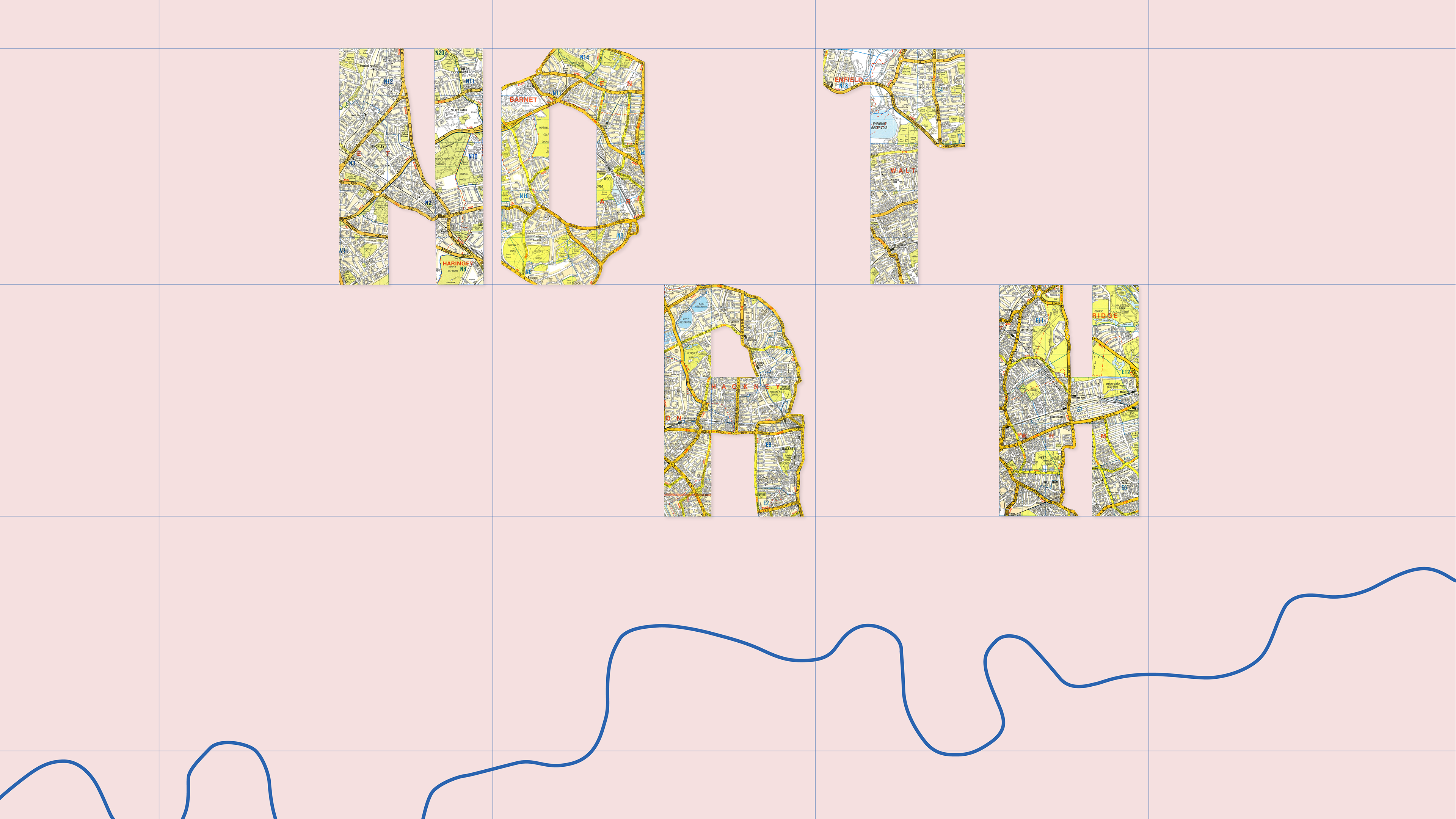
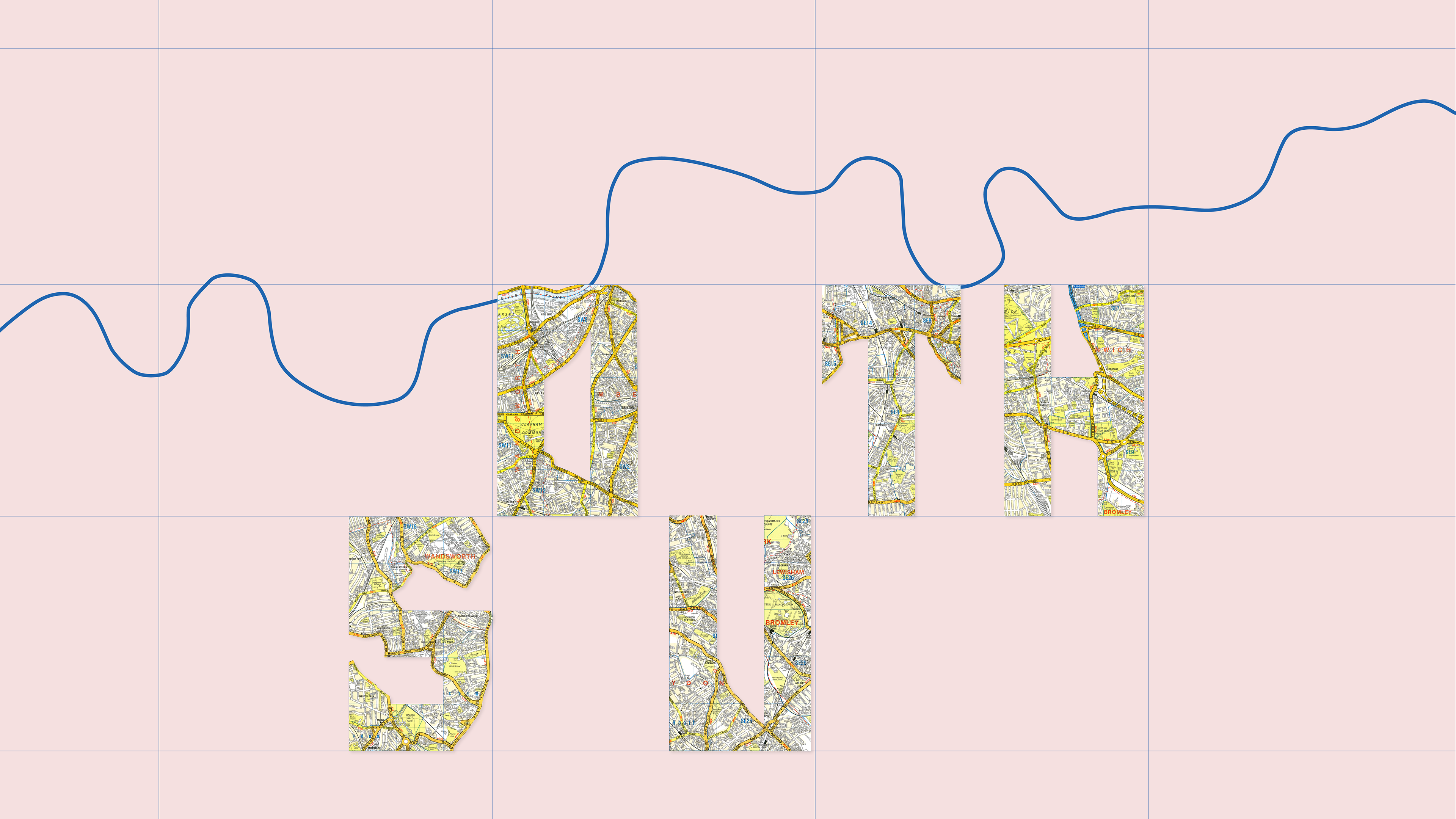
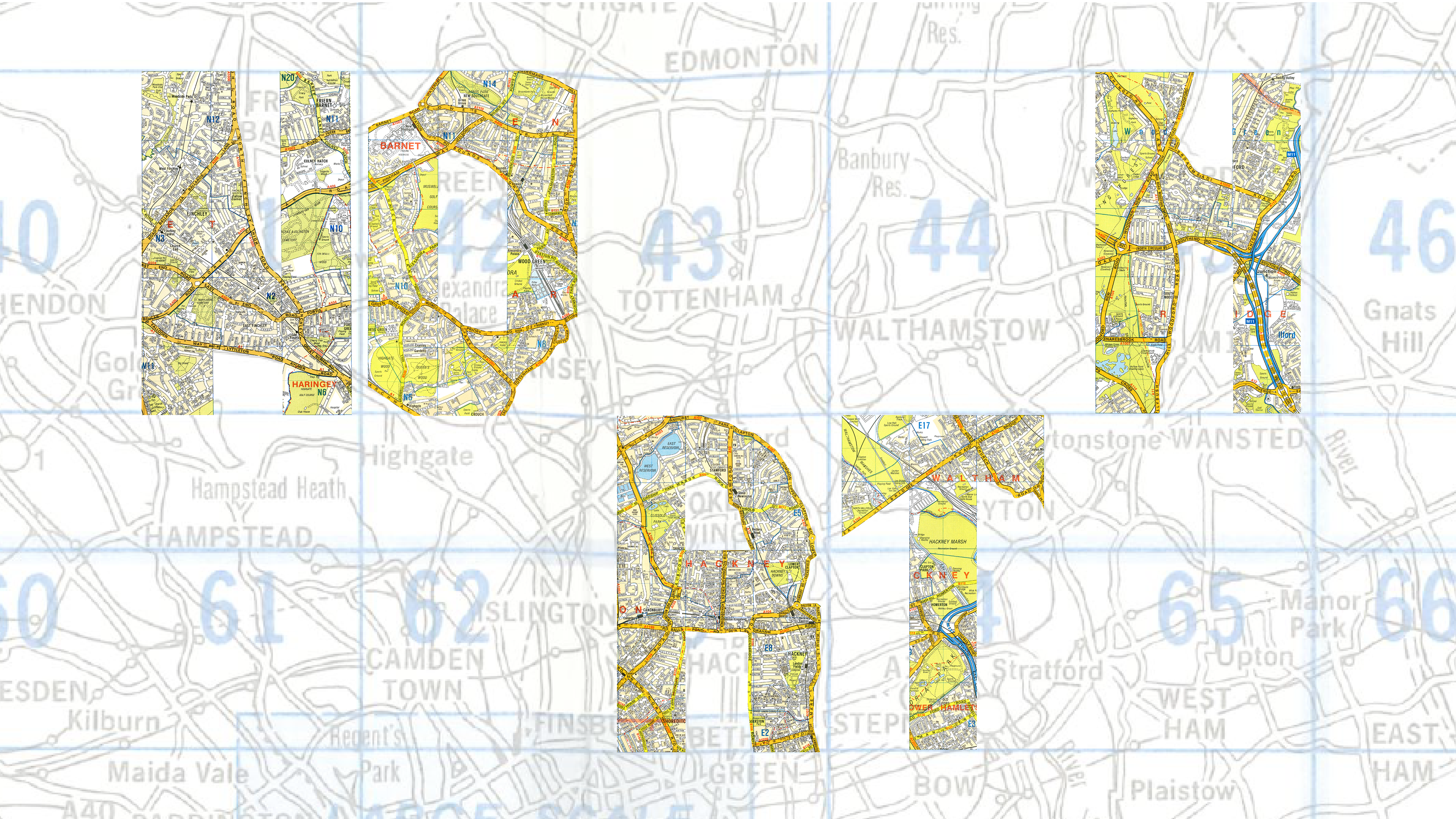
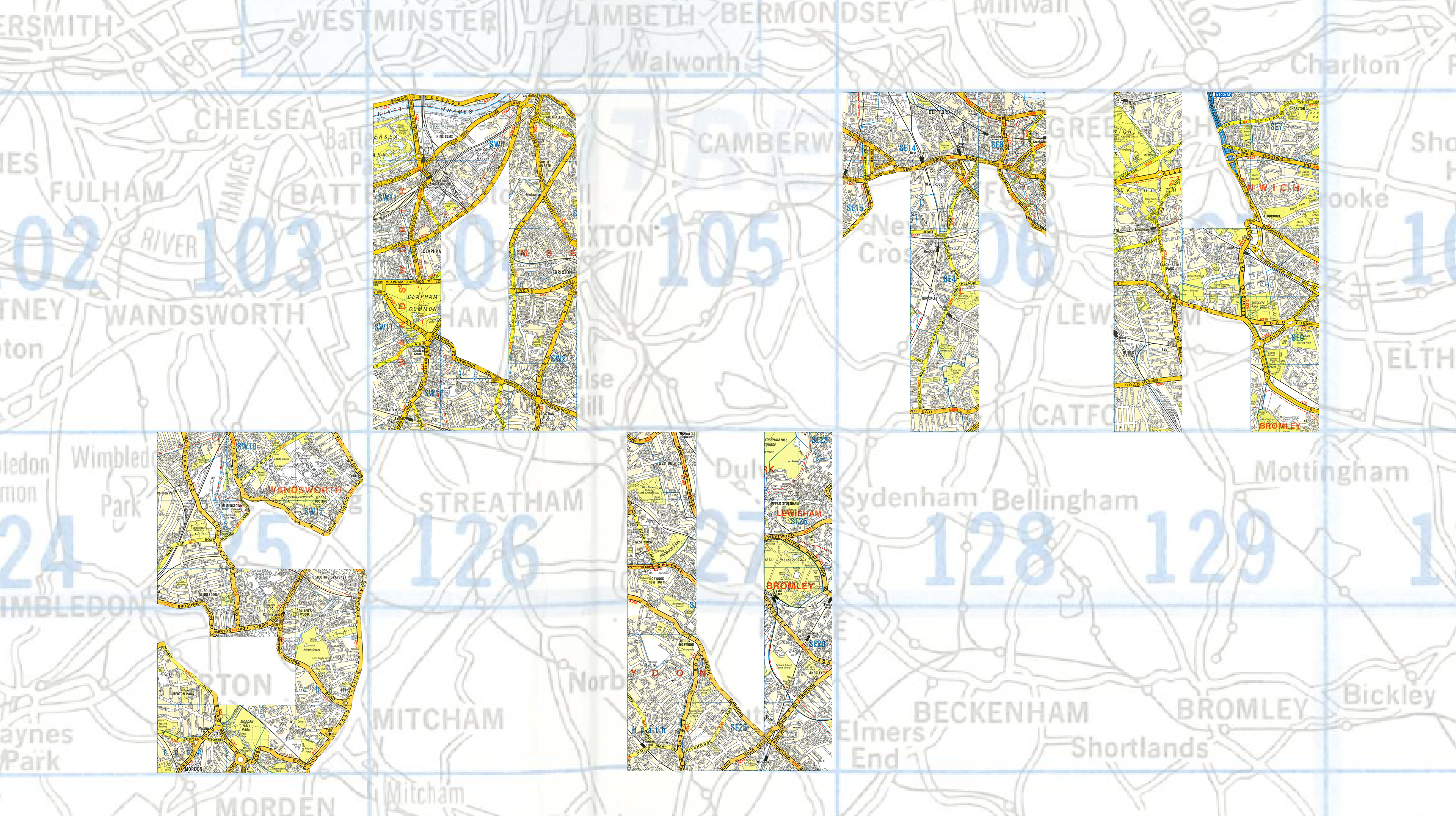
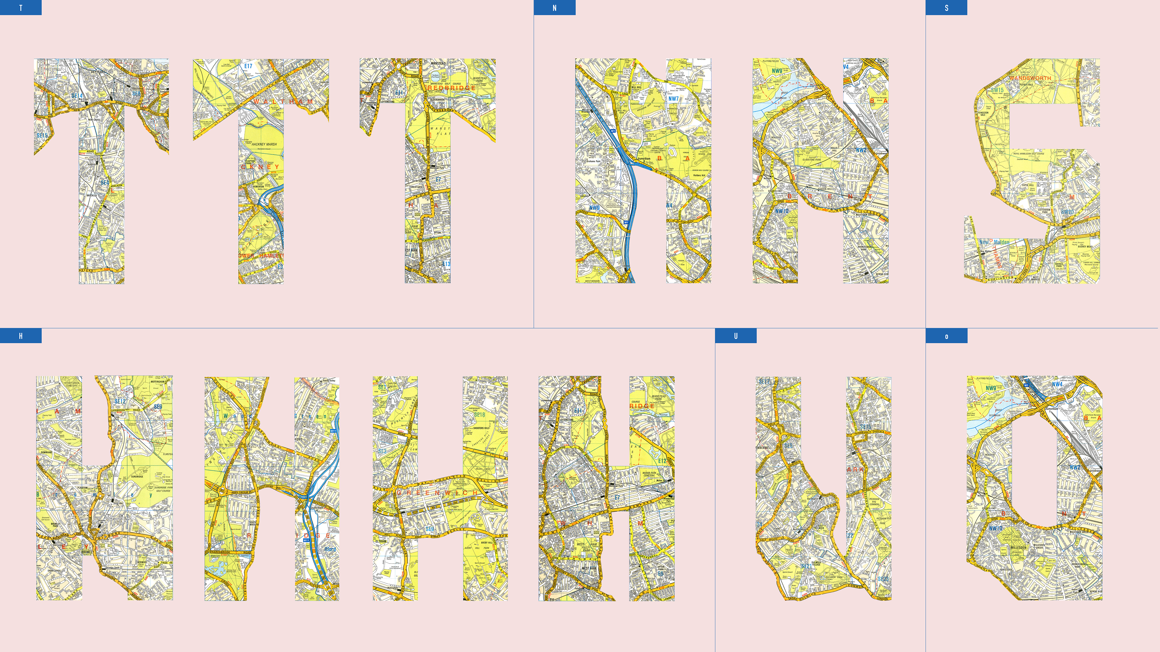
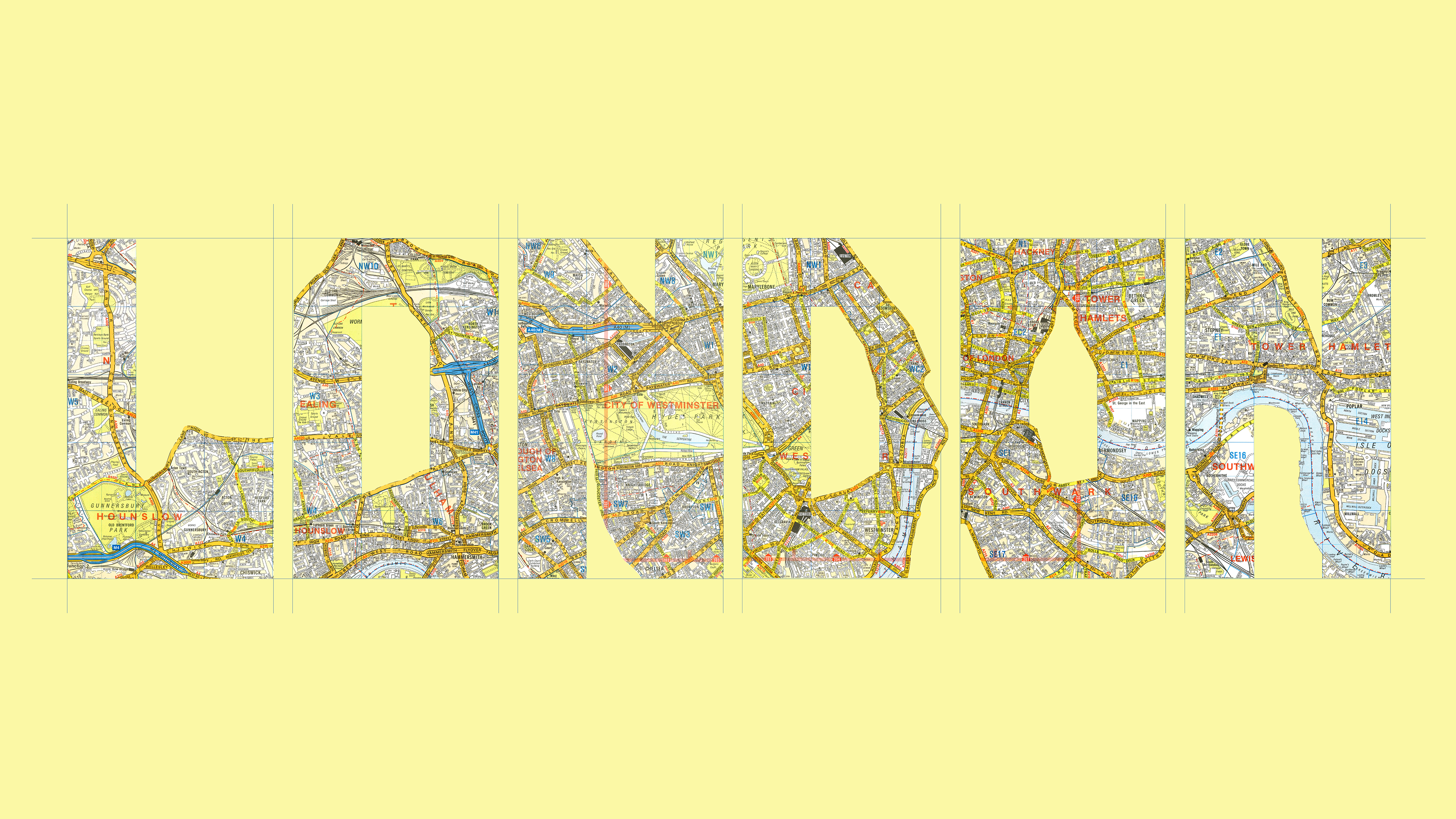
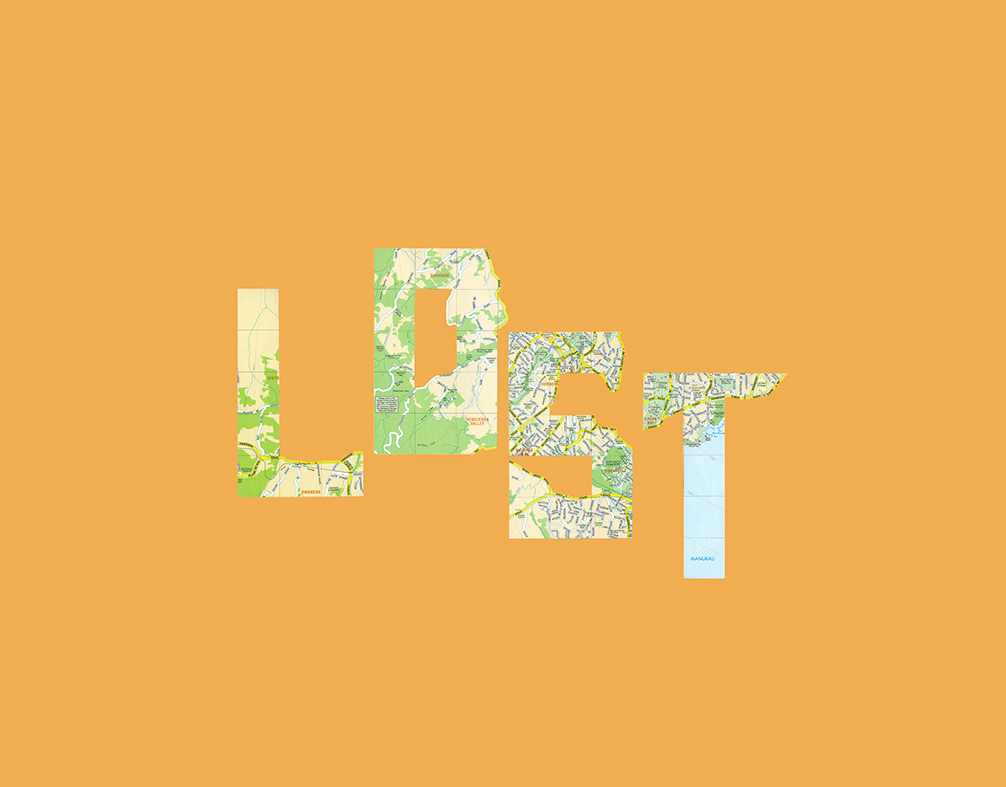
I love the challenge of finding type in the wild. For this series, I treated the London map as my brief. I developed these letters by following the city’s DNA, using the map grid for the "bones" and the organic flow of the streets for the curves. By sticking to these real-world constraints, I was able to reimagine a familiar map as a storytelling tool, proving that even a busy road layout has a hidden structure.
An alphabet designed by Art Director Ben Barnes using London’s map grid as a structural blueprint, turning "found" urban layouts into expressive storytelling type.
Map of London overlaid with typographic structures, showing the design process of extracting letterforms from urban geography by Art Director Ben Barnes at Found Studio.
Custom letterforms 'L' 'O' 'N'  by Ben Barnes, reimagined from the London city map where actual street paths and road curves dictate the shape of the character.

Check out my other lettering projects

☝️Back to Top