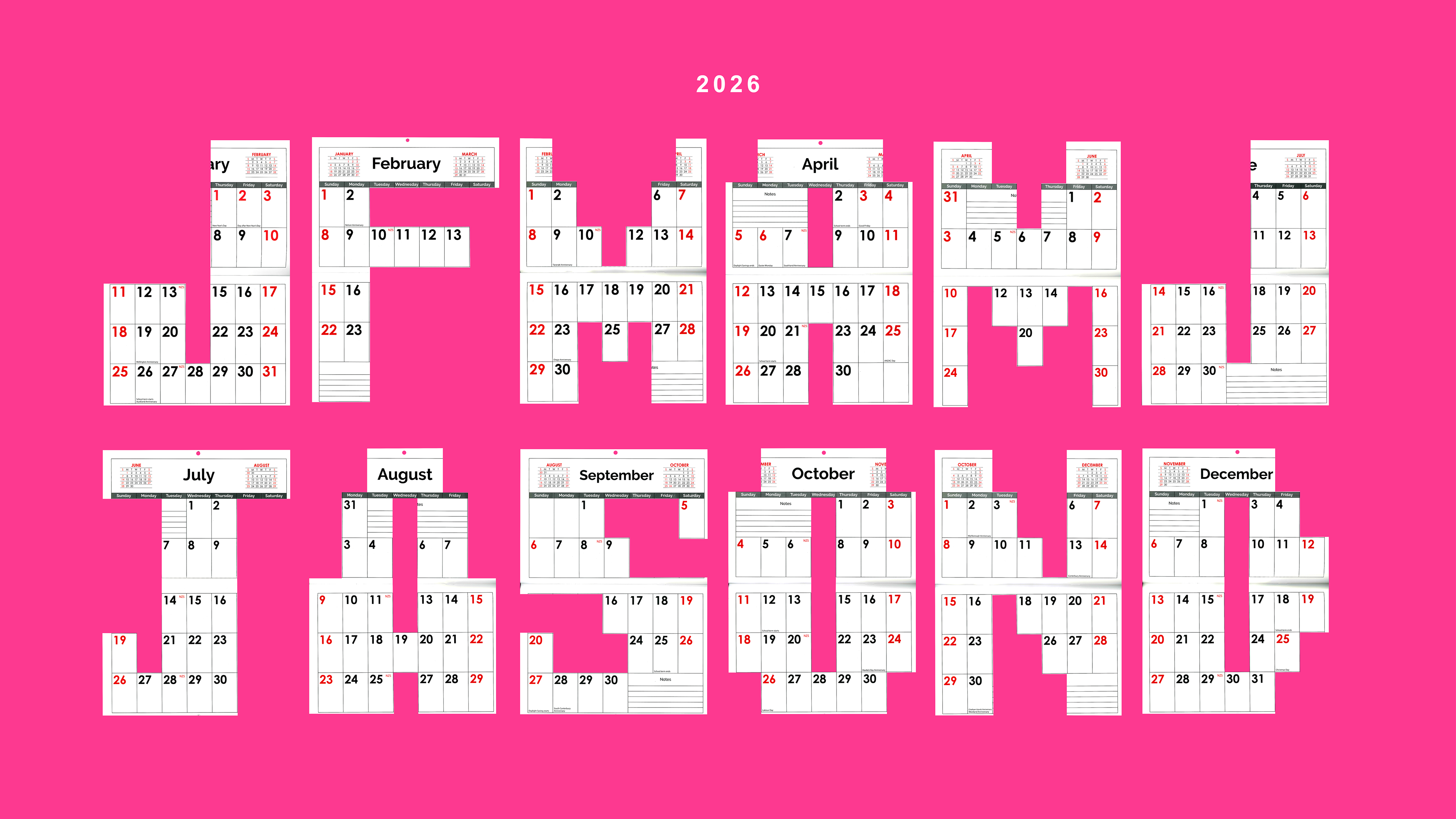
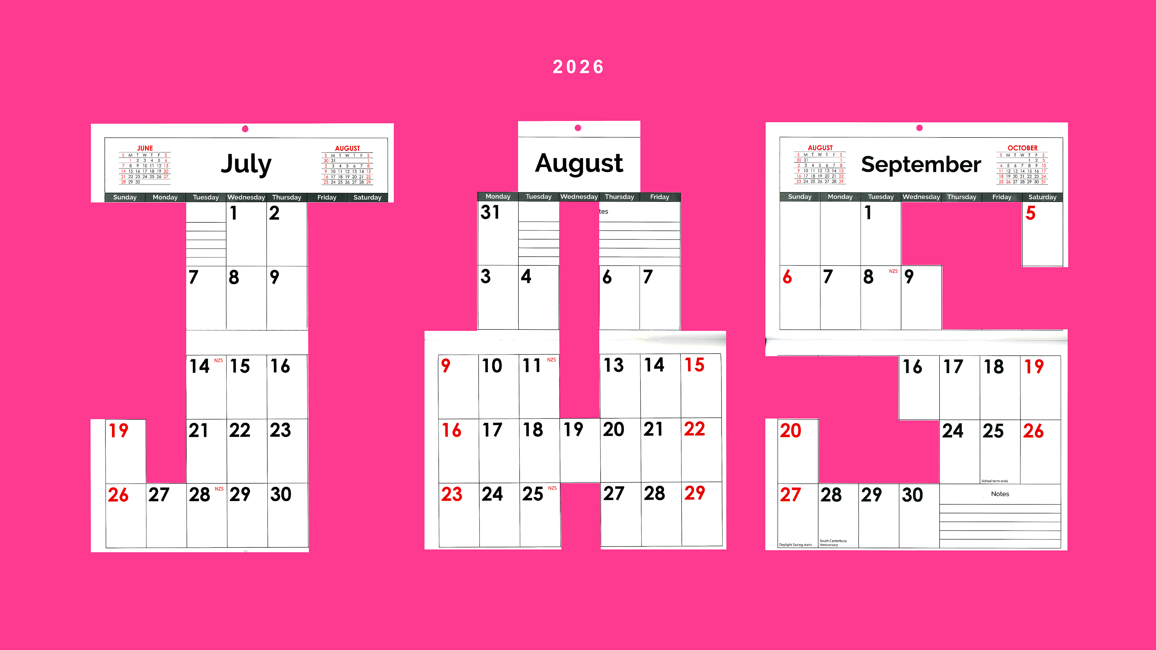
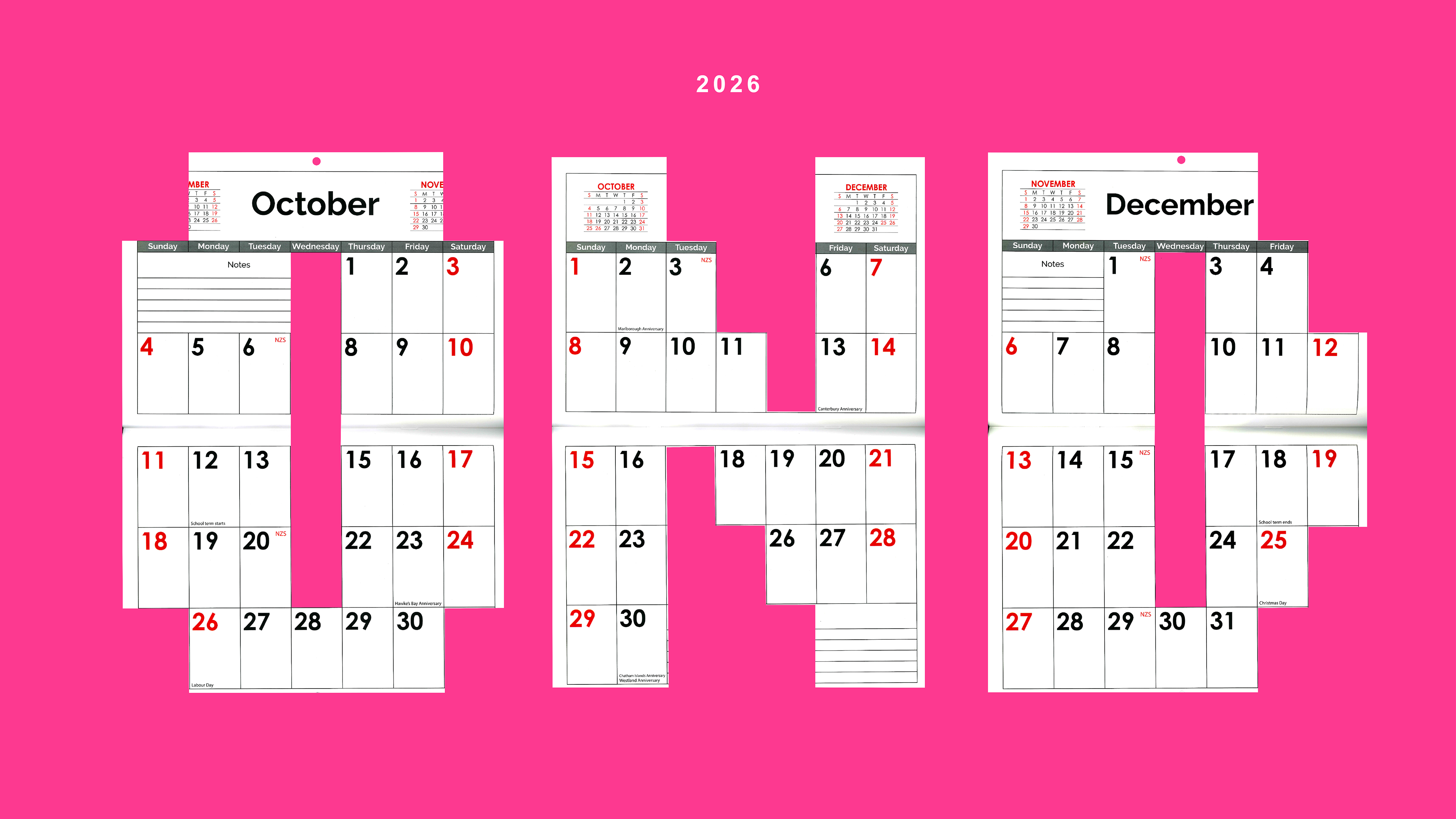
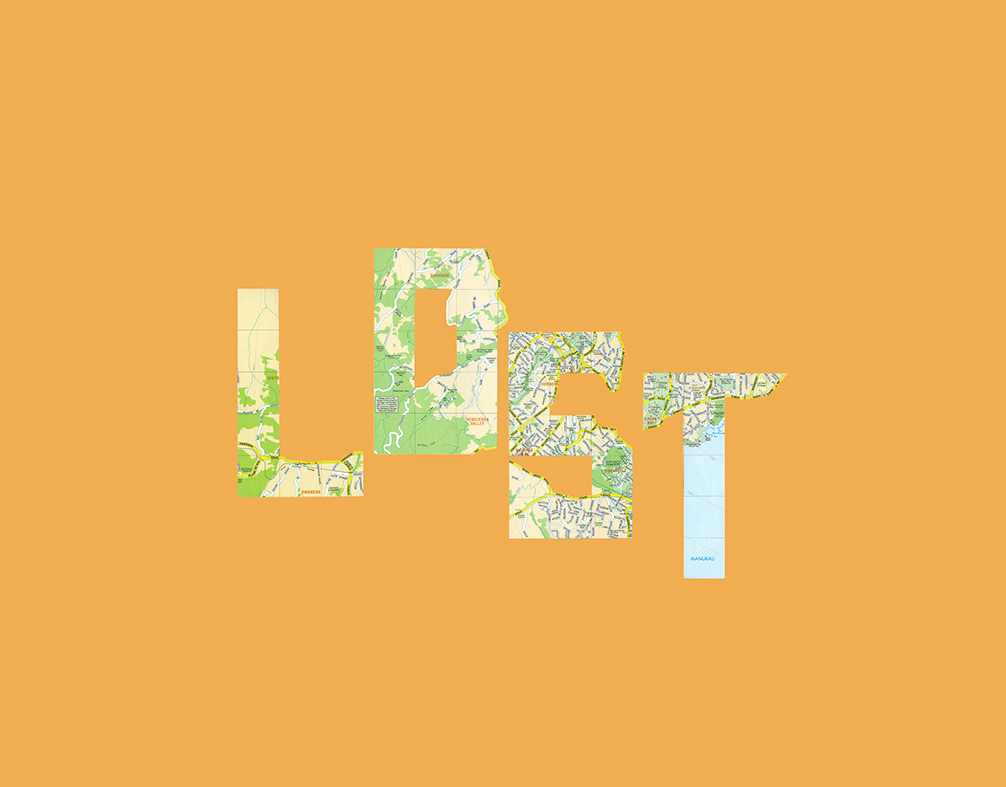
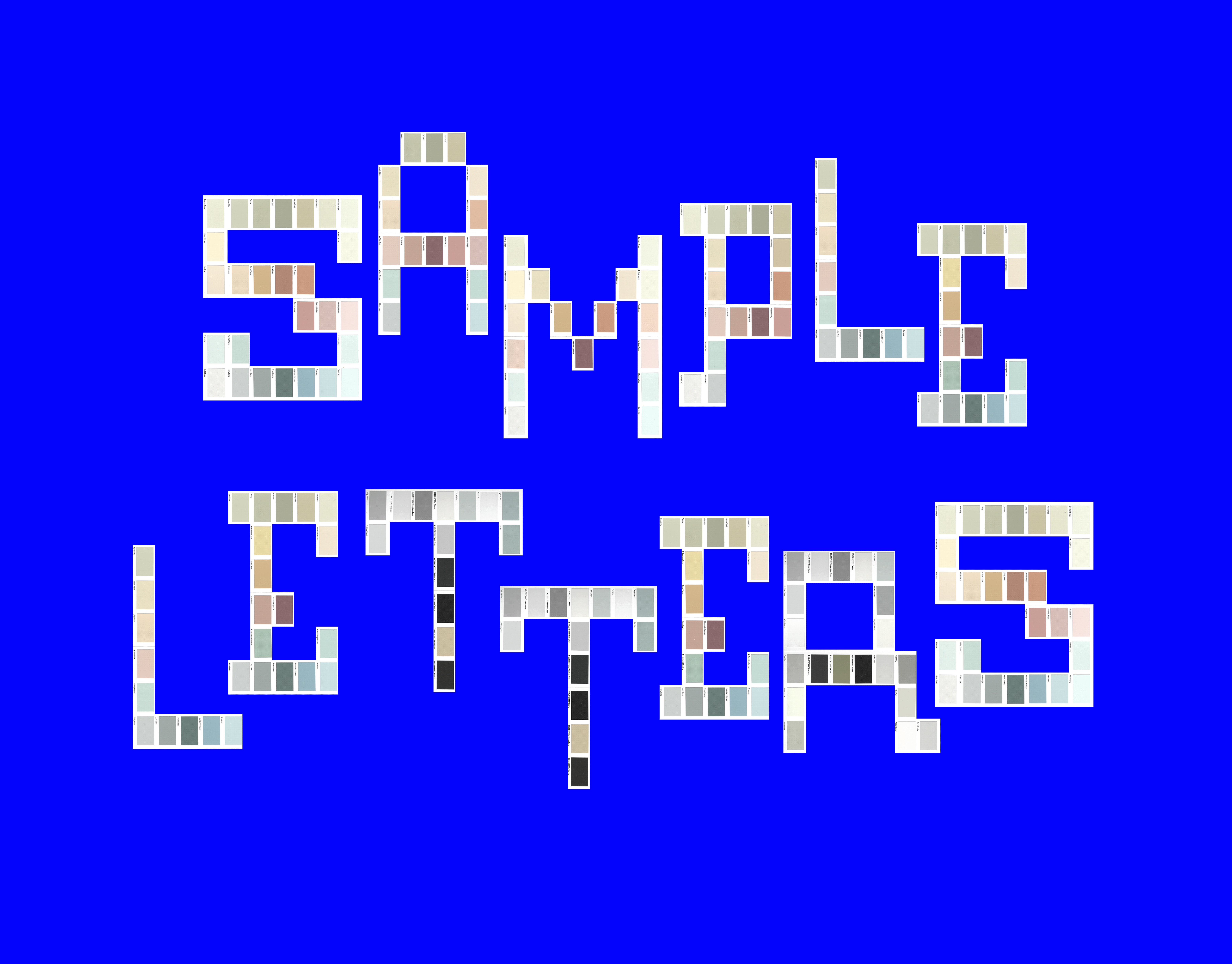
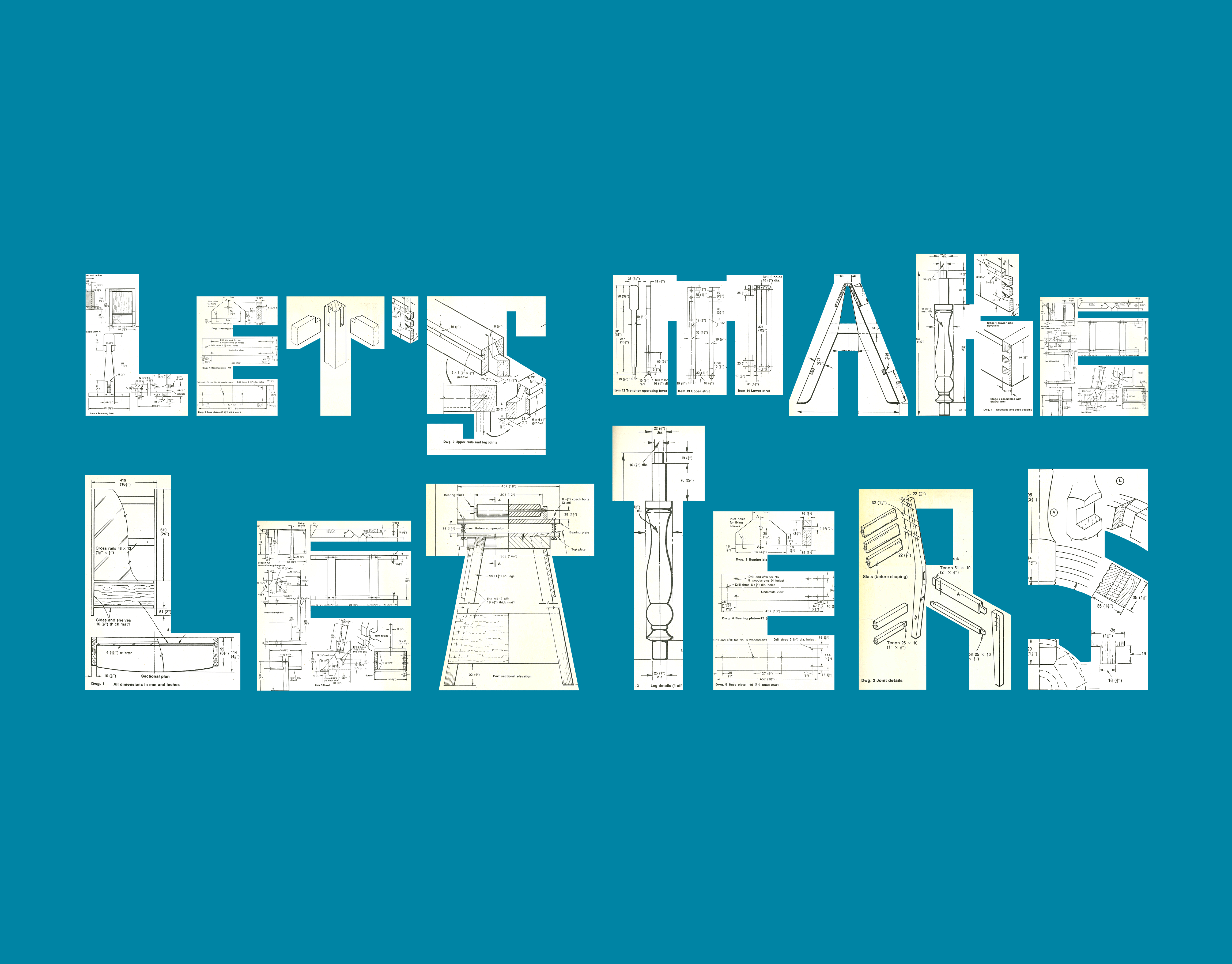
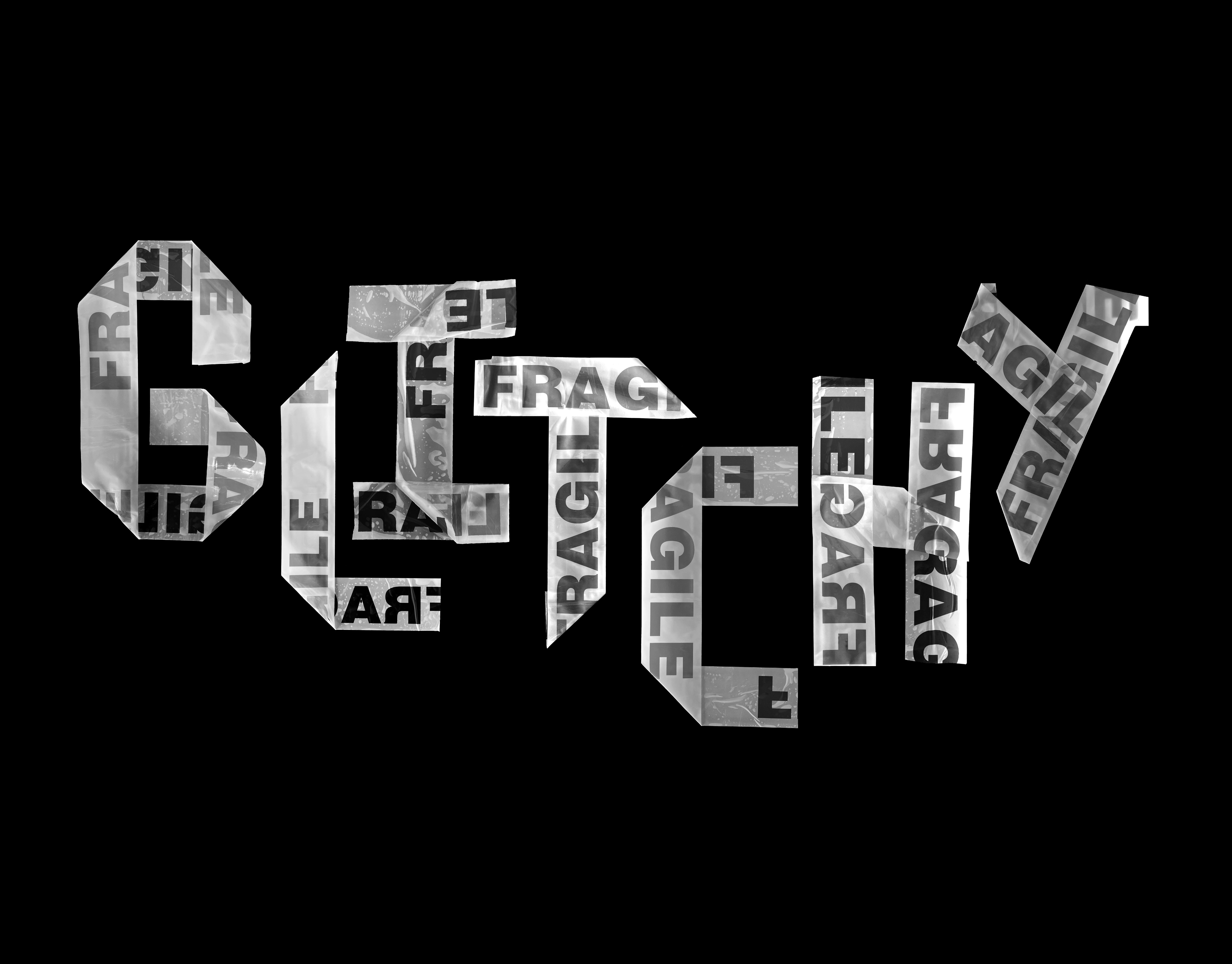
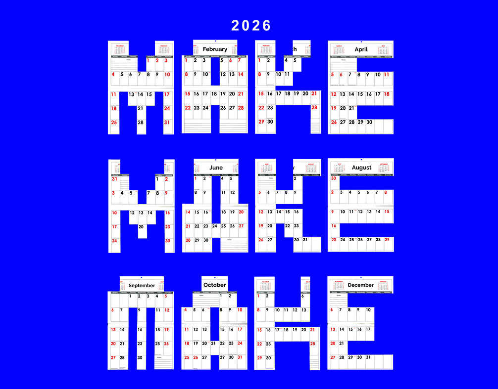
I’m a big believer that designing within strict constraints can lead to the most surprising results. For this project, I used the 2026 calendar grid as my only playground. I developed this custom lettering series by mapping out one letter per month, ensuring the weight and rhythm of each character stayed locked into the calendar’s DNA. By staying true to that classic formality, I wanted to show that even a rigid grid can find a fresh voice.
A series of typographic letterforms designed by Art Director Ben Barnes, where each character is structurally built from the layout of different months in a 2026 calendar.
Custom letters 'J' 'A'  & 'S' designed by Art Director Ben Barnes, using the internal grid and date-box structure of a 2026 calendar page to dictate the letterform.
Close-up of systematic typography by Ben Barnes, showing how the vertical and horizontal intersections of a calendar grid inform the weight of the letter strokes.

Check out my other lettering projects

☝️Back to Top