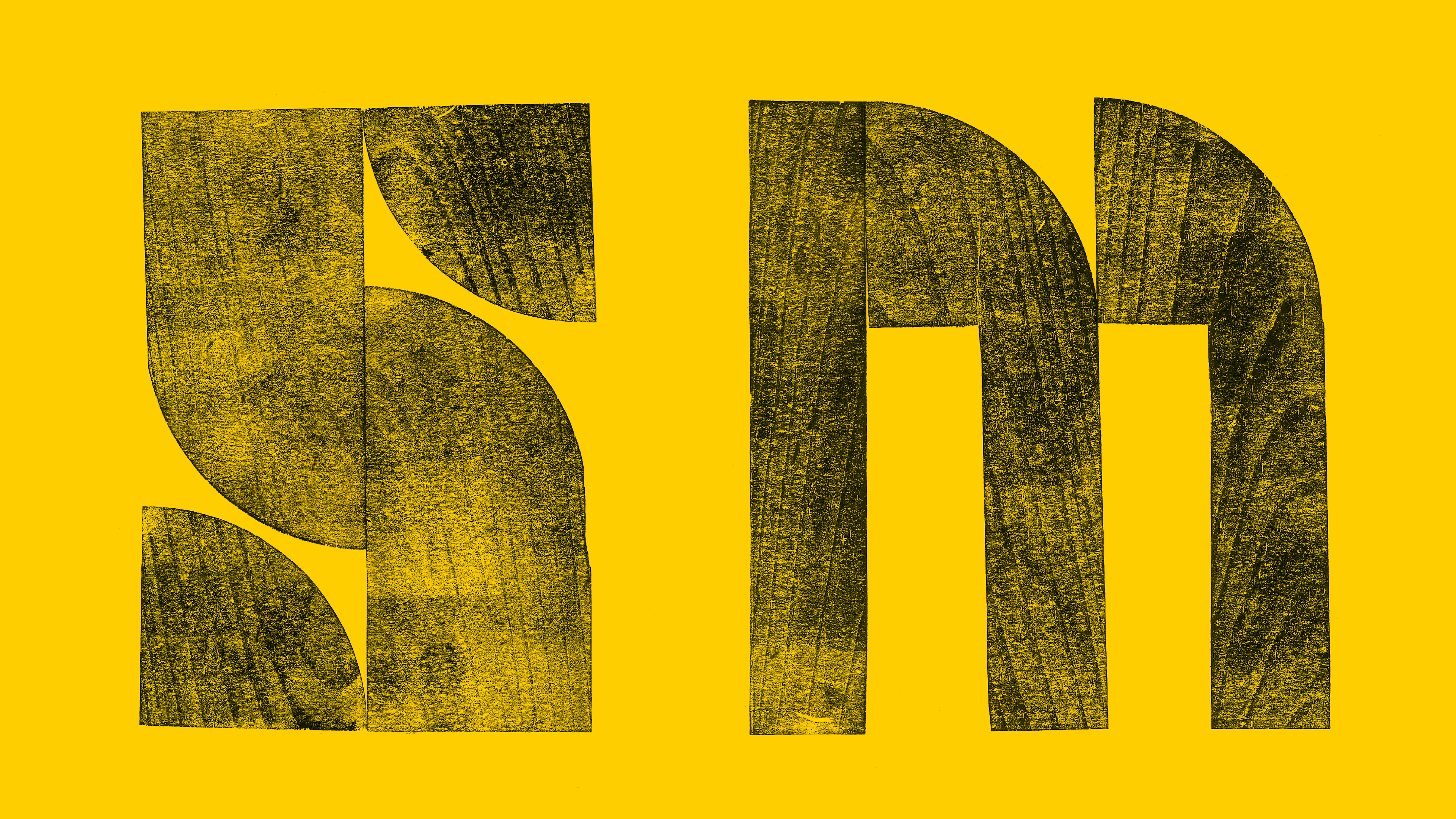
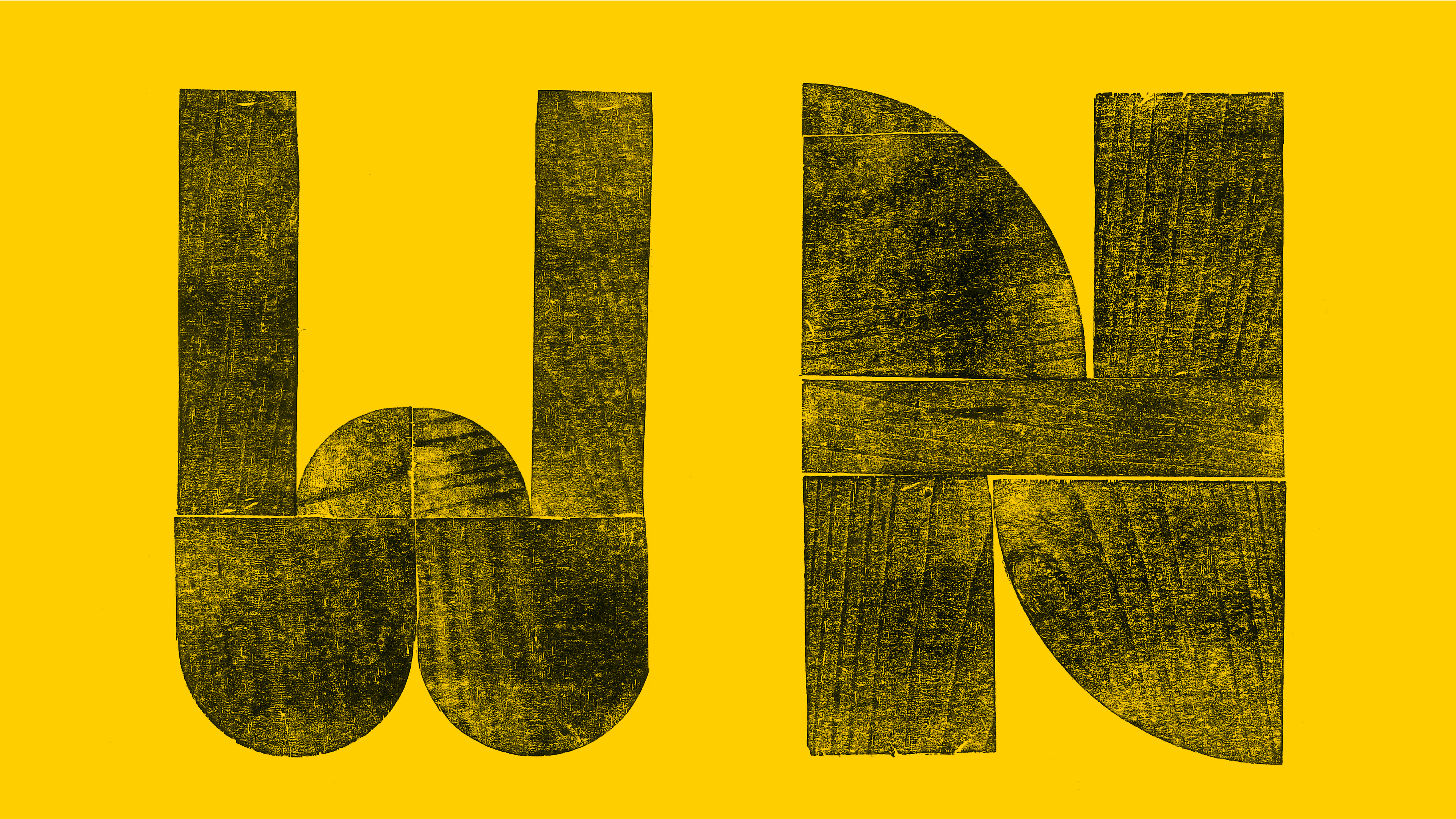
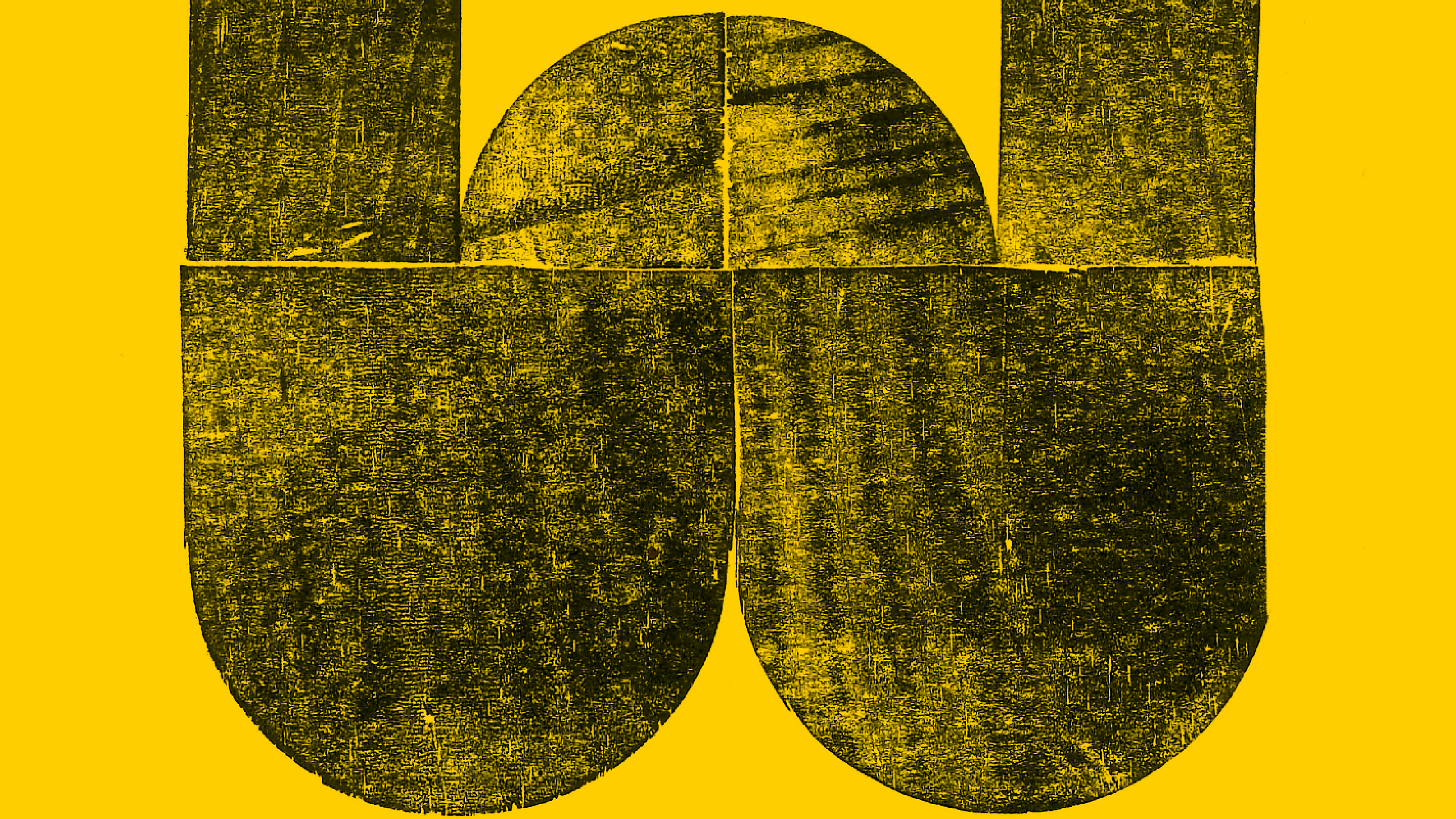
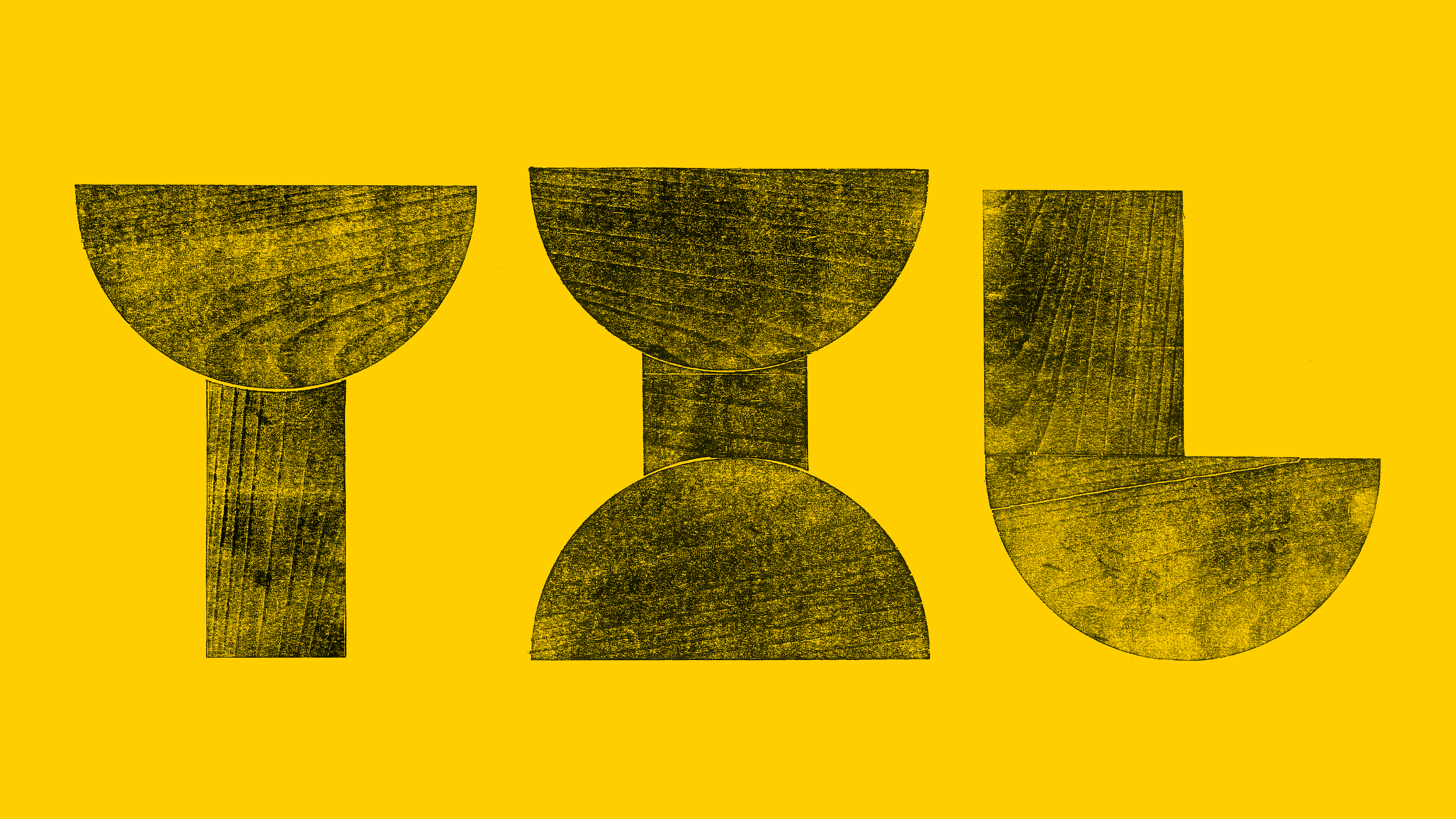
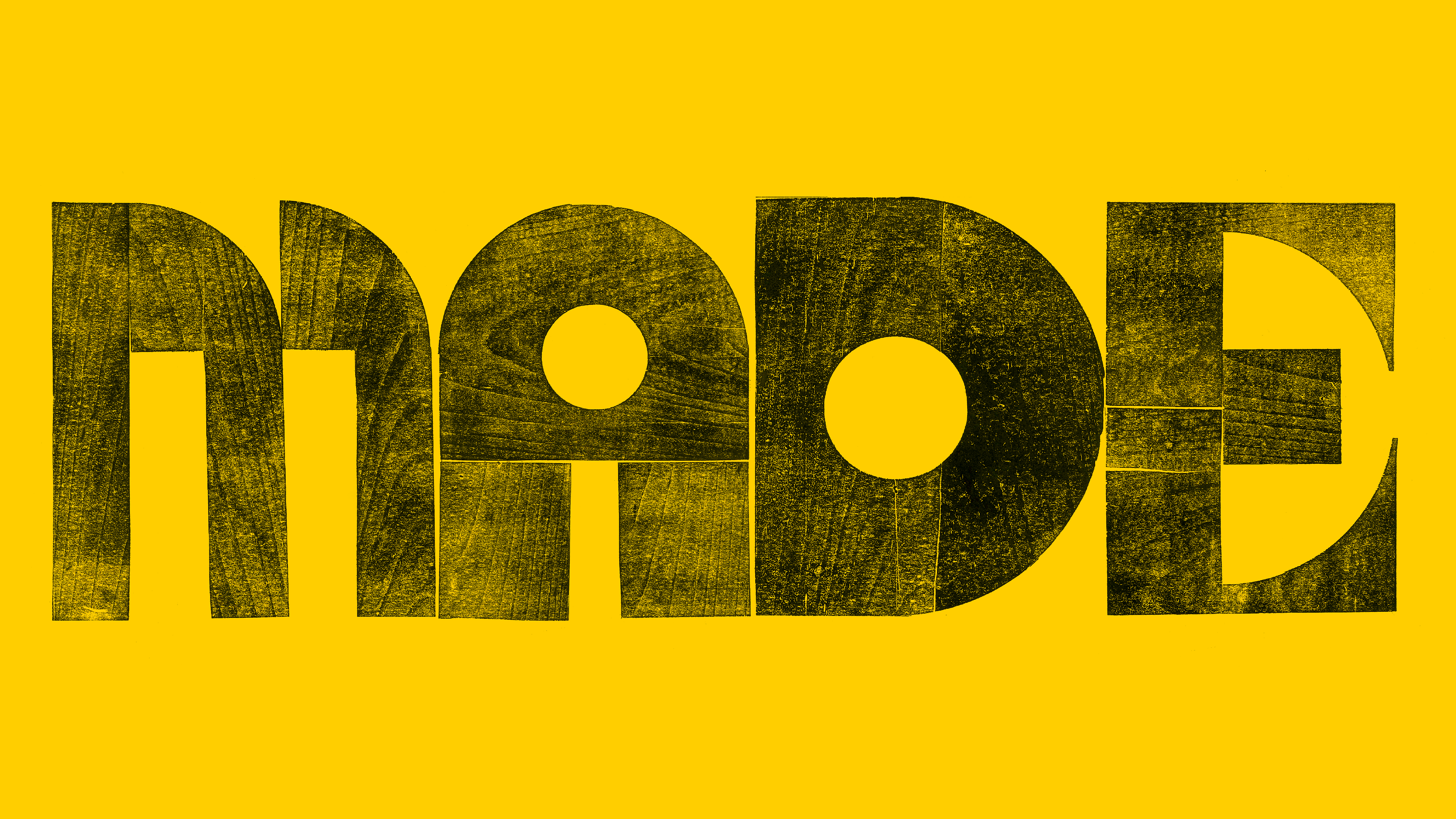
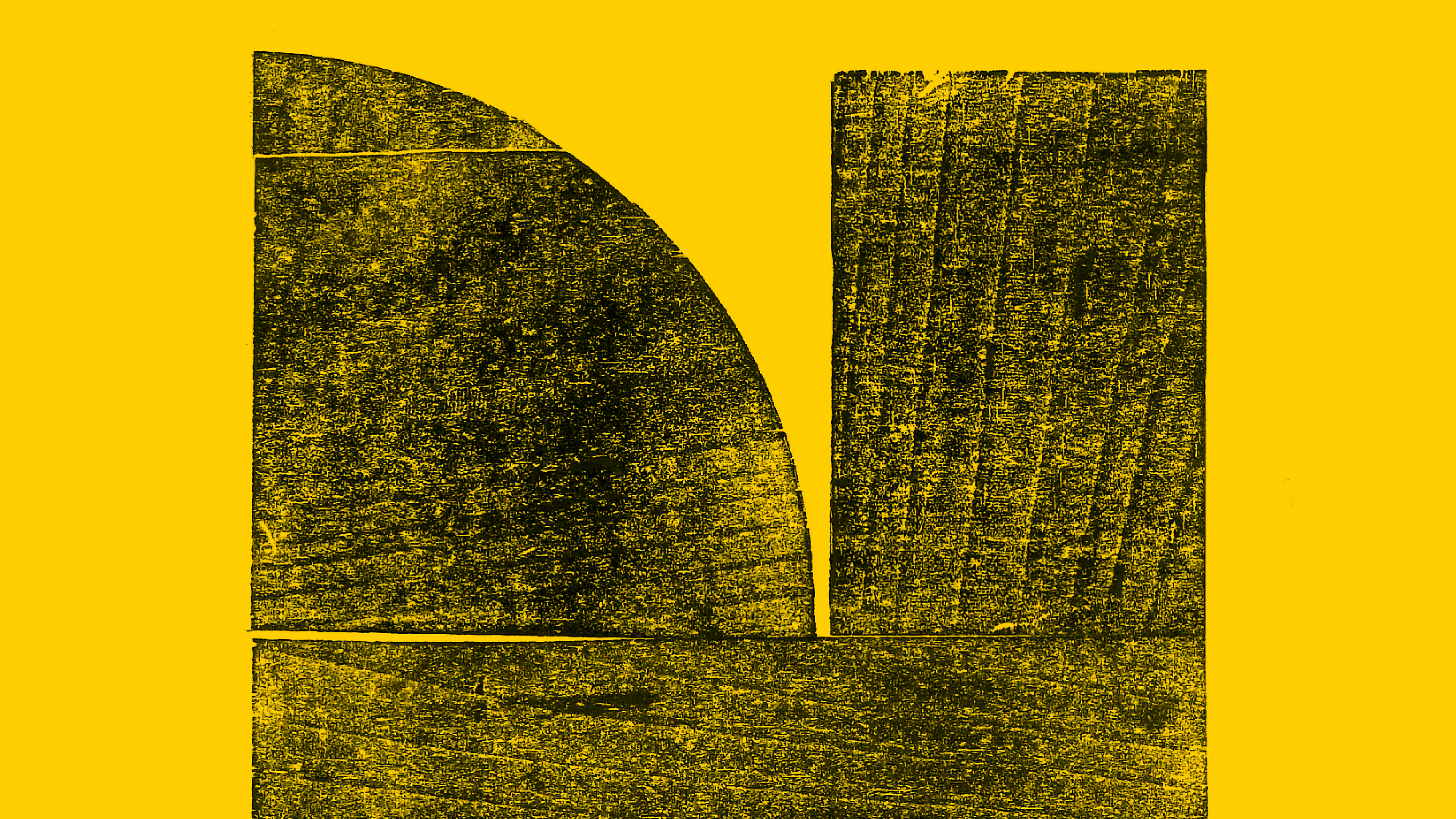
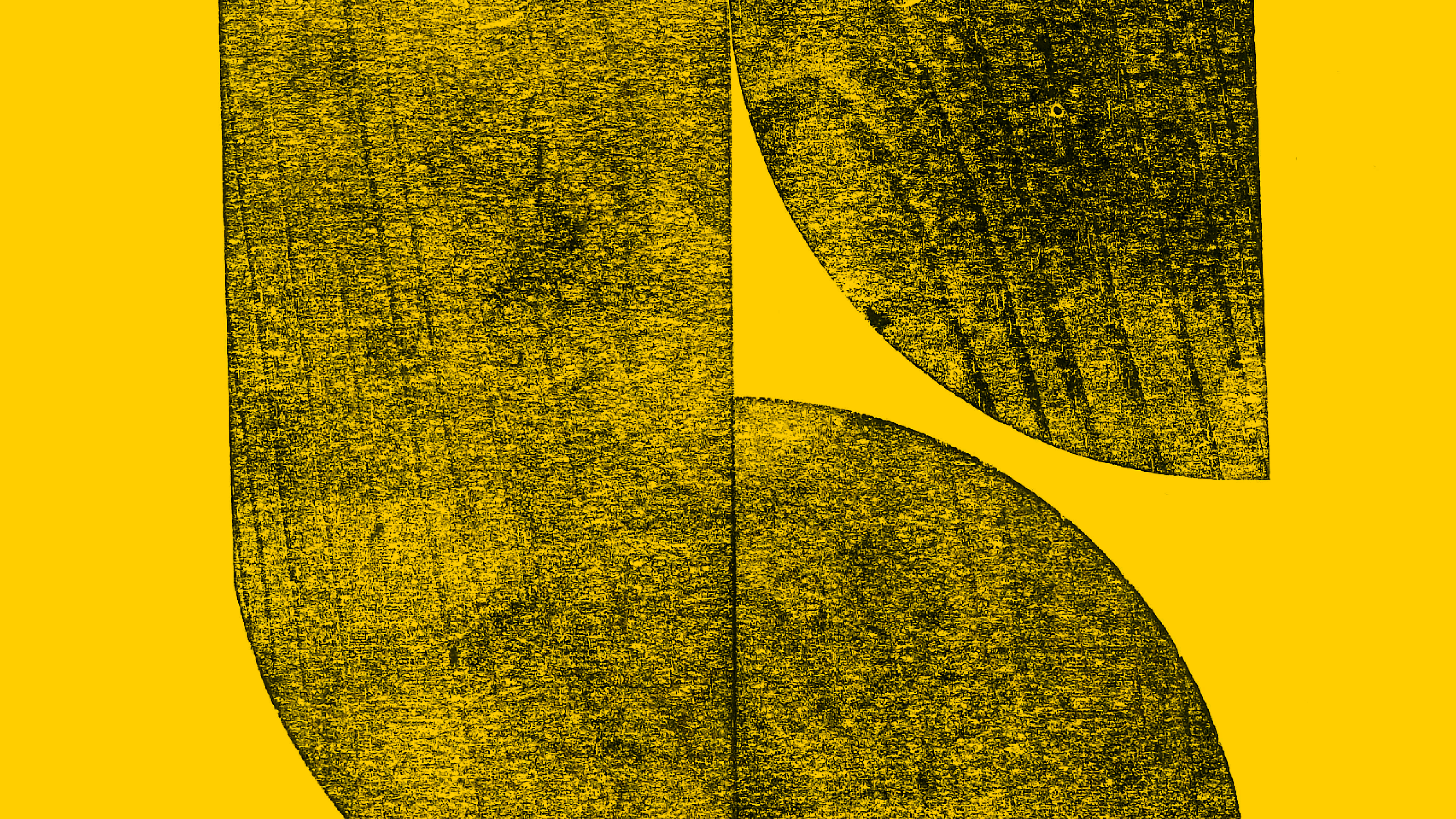
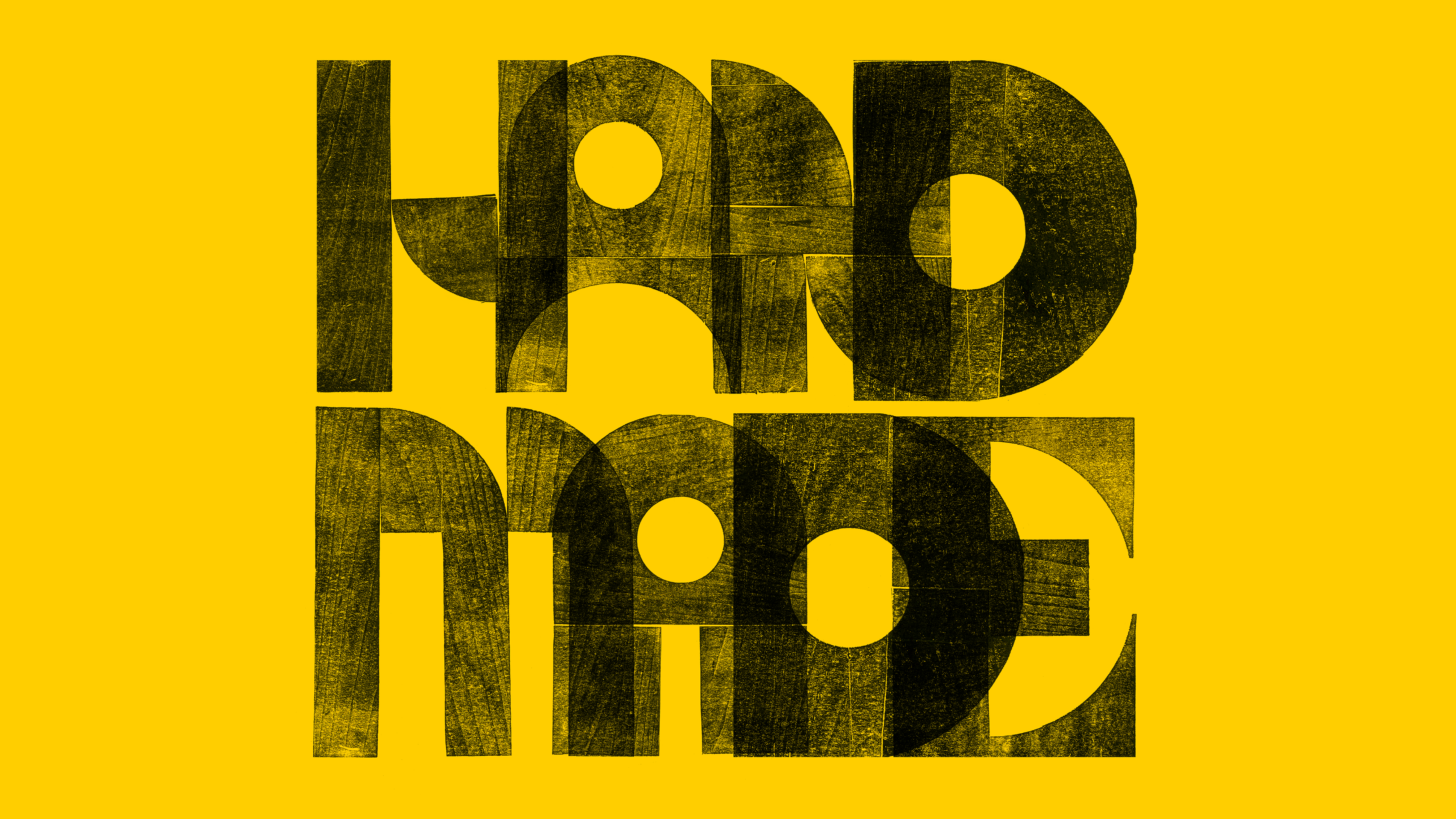
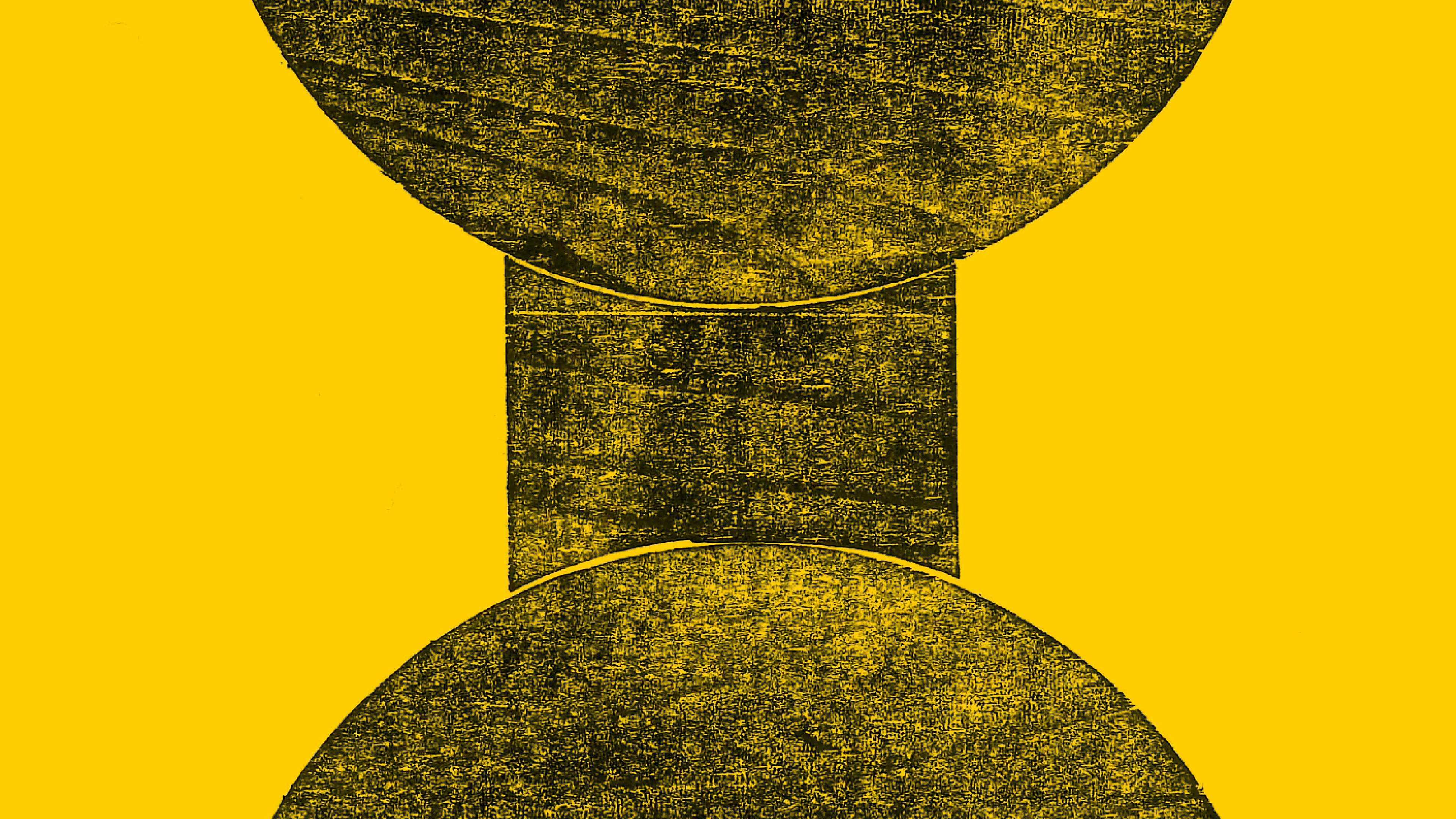
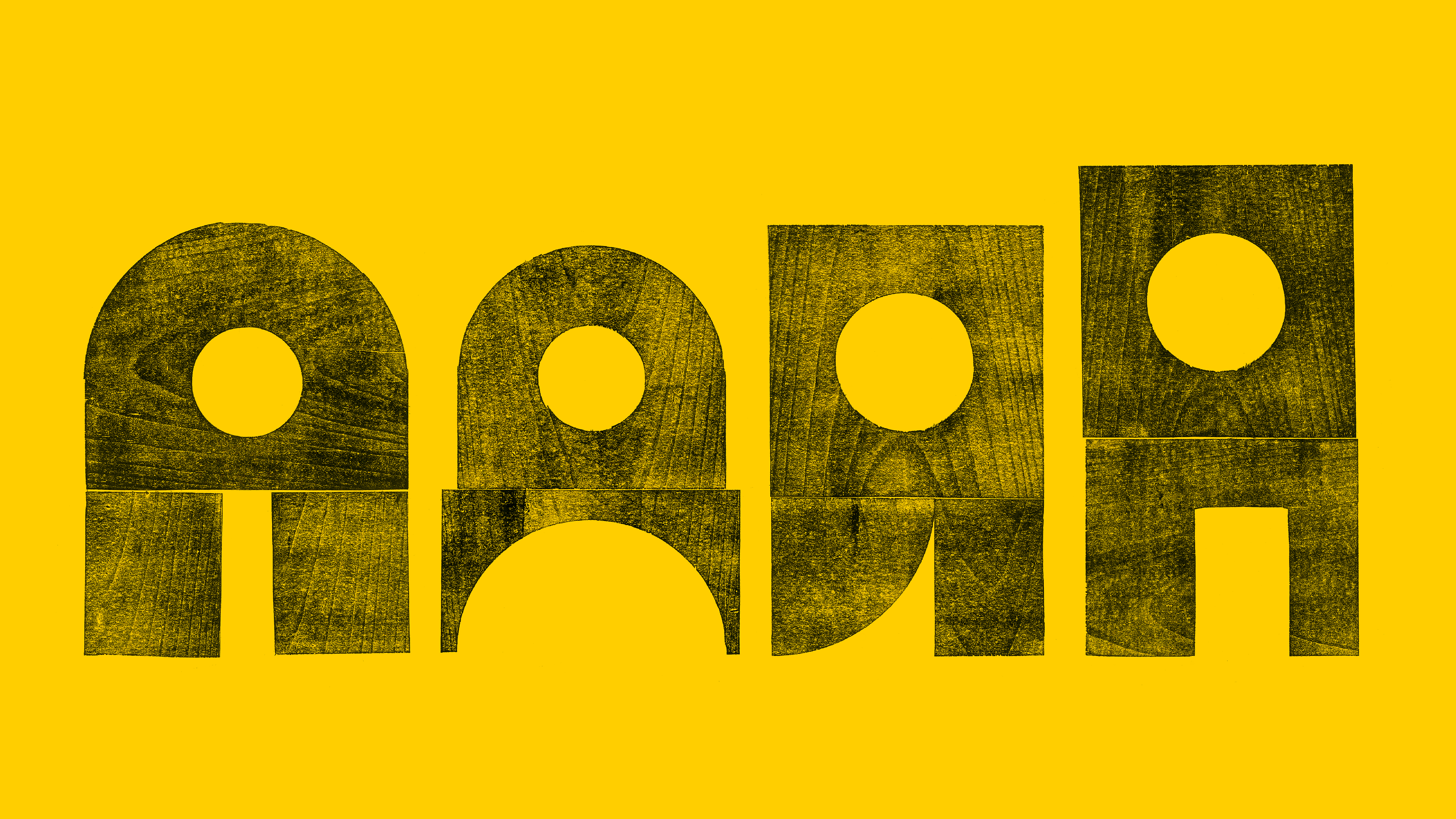
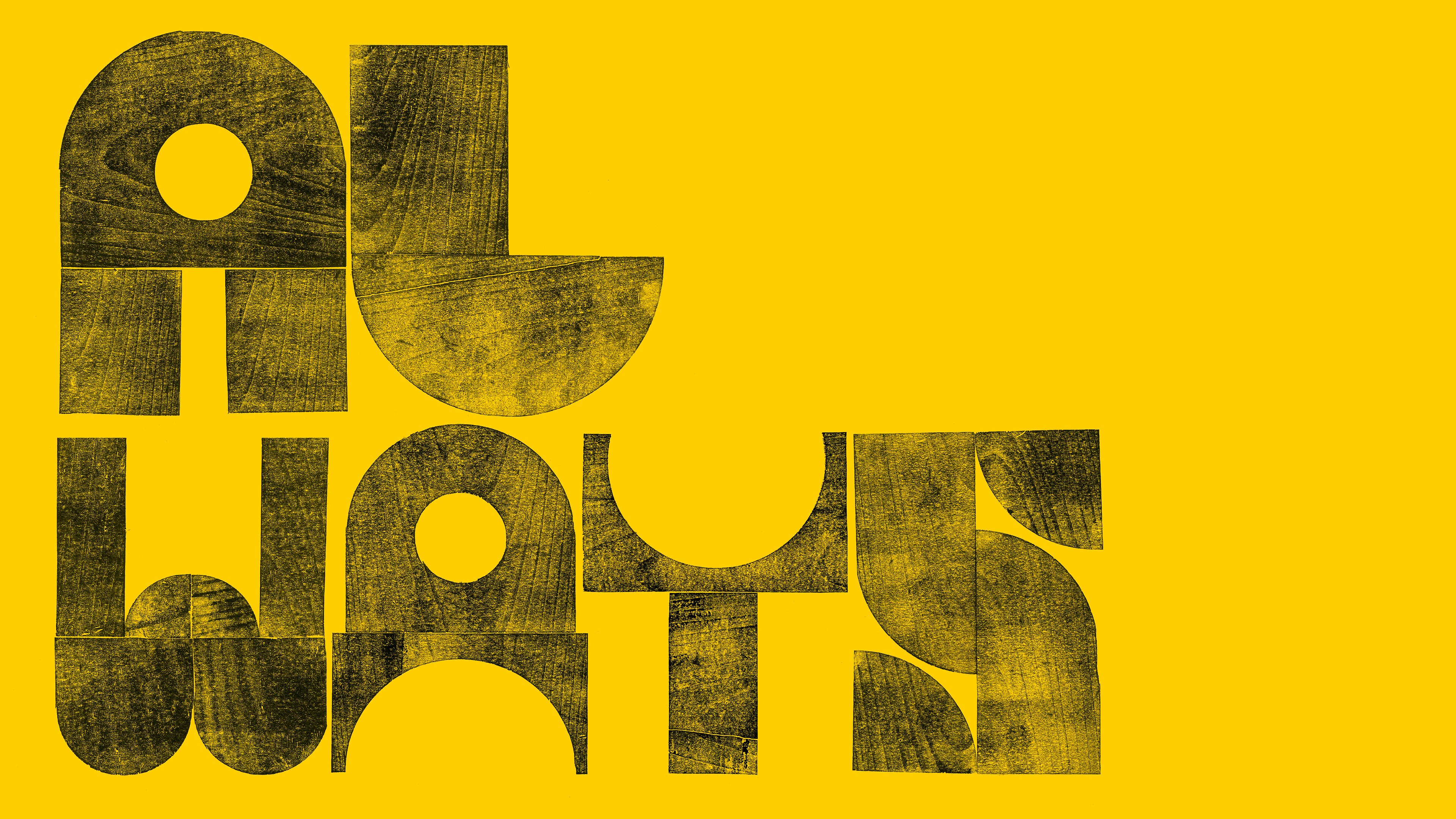
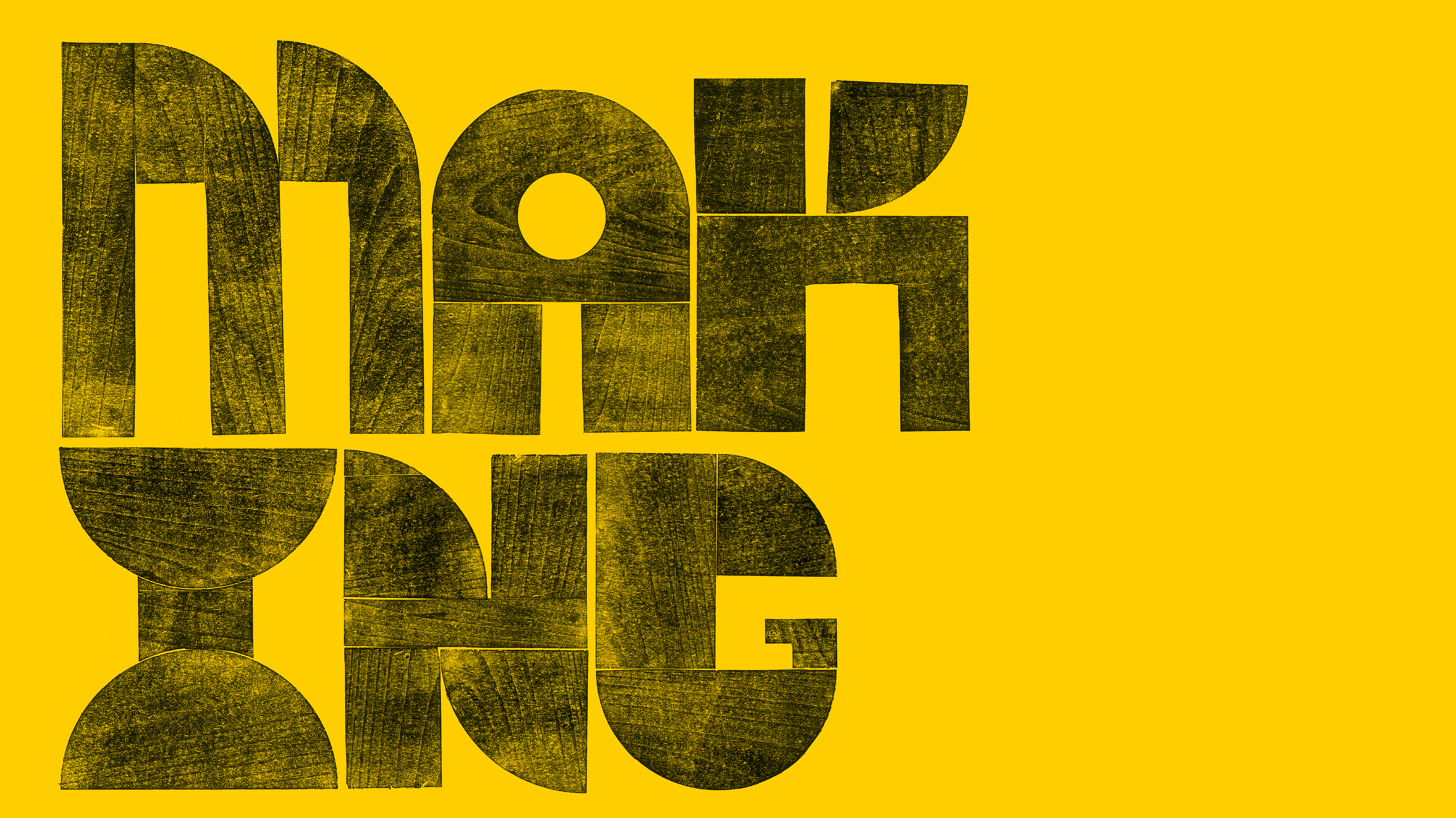
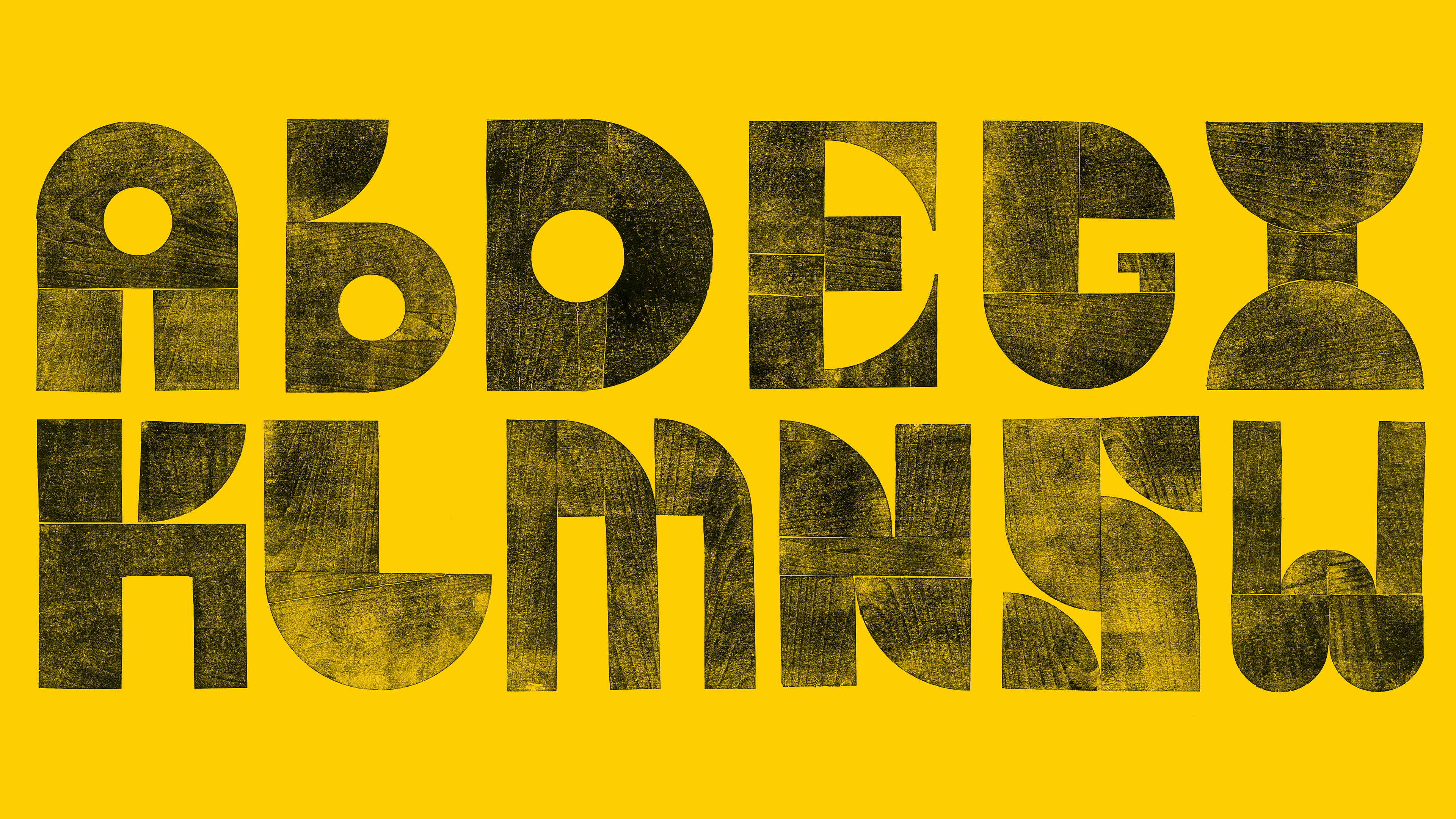
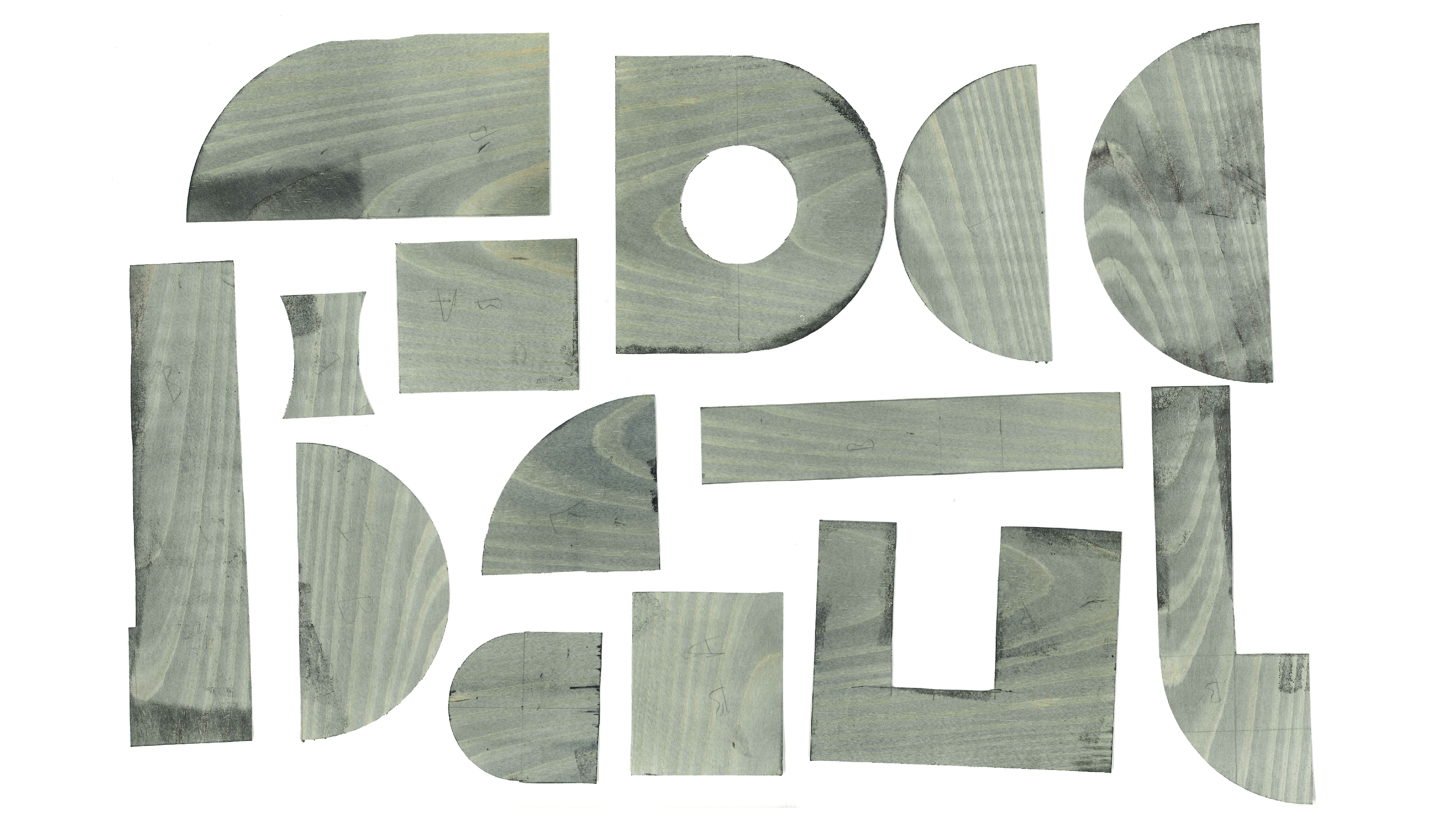
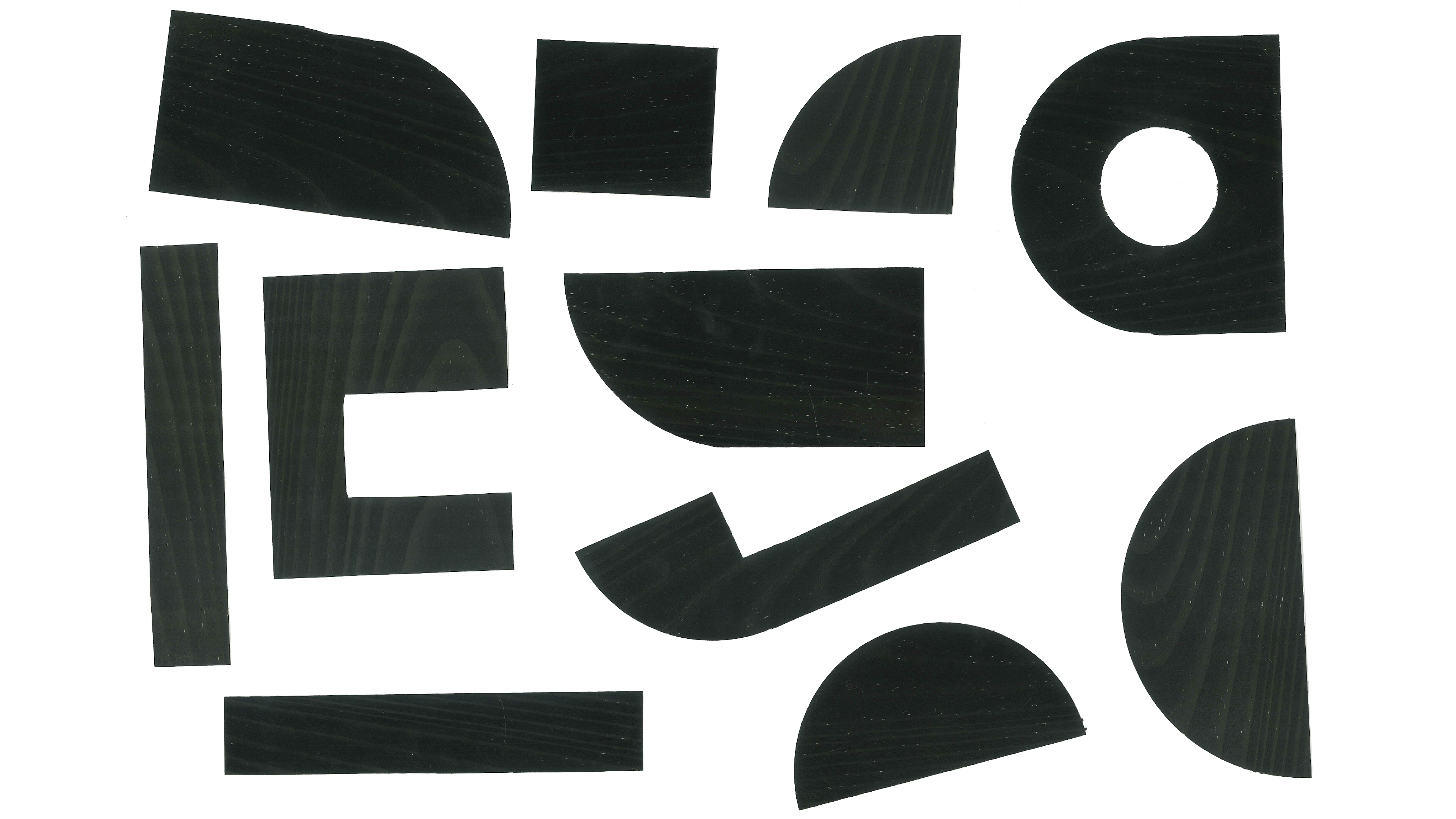
Typography as architecture. Using ultra-thin Japanese wood paper, I hand-cut geometric shards to serve as the building blocks for each character. By inking and printing every element individually, I allowed the seams to stay visible, celebrating the grain, the joinery, and the tactile beauty of a letter built by hand.