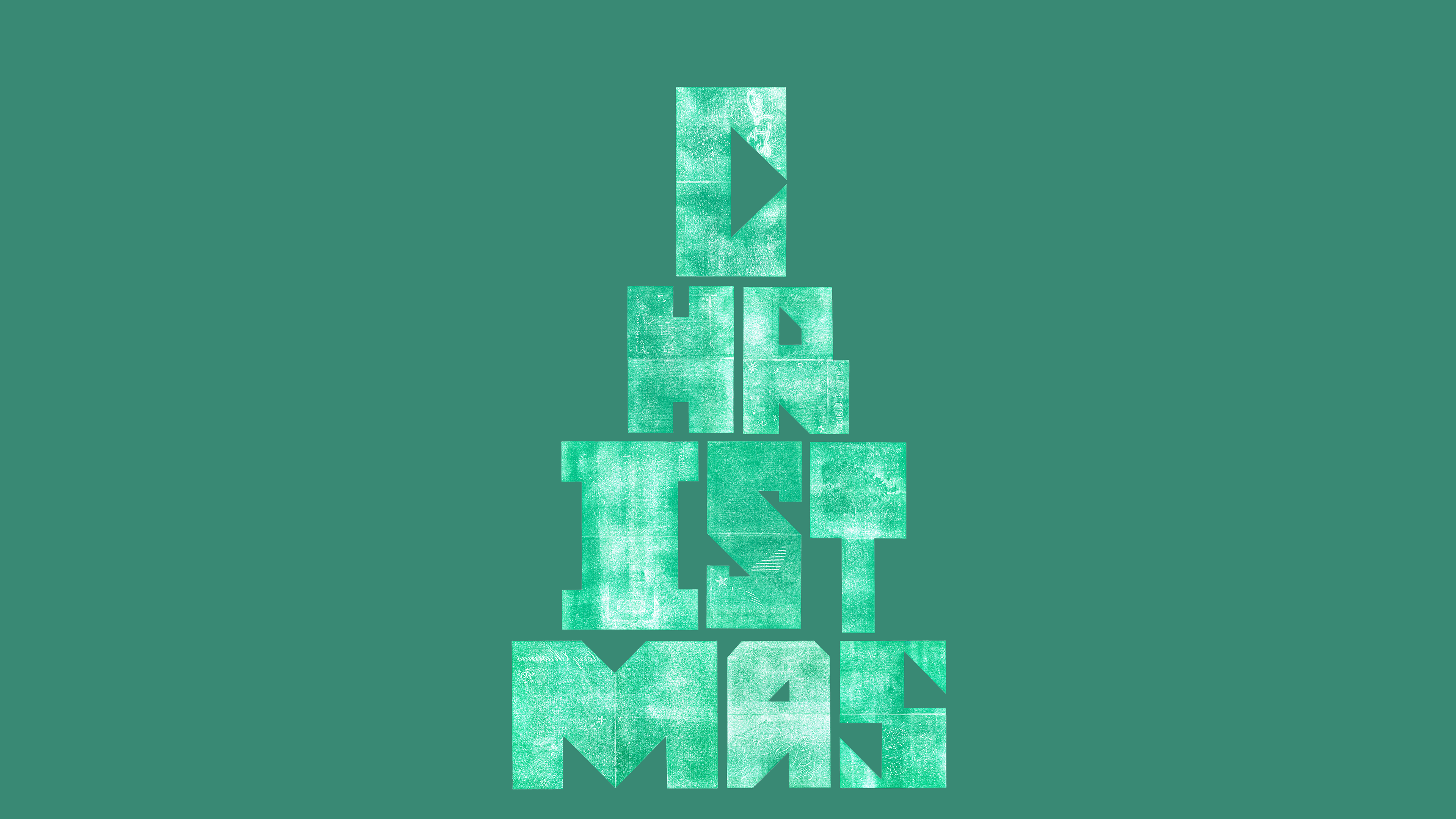
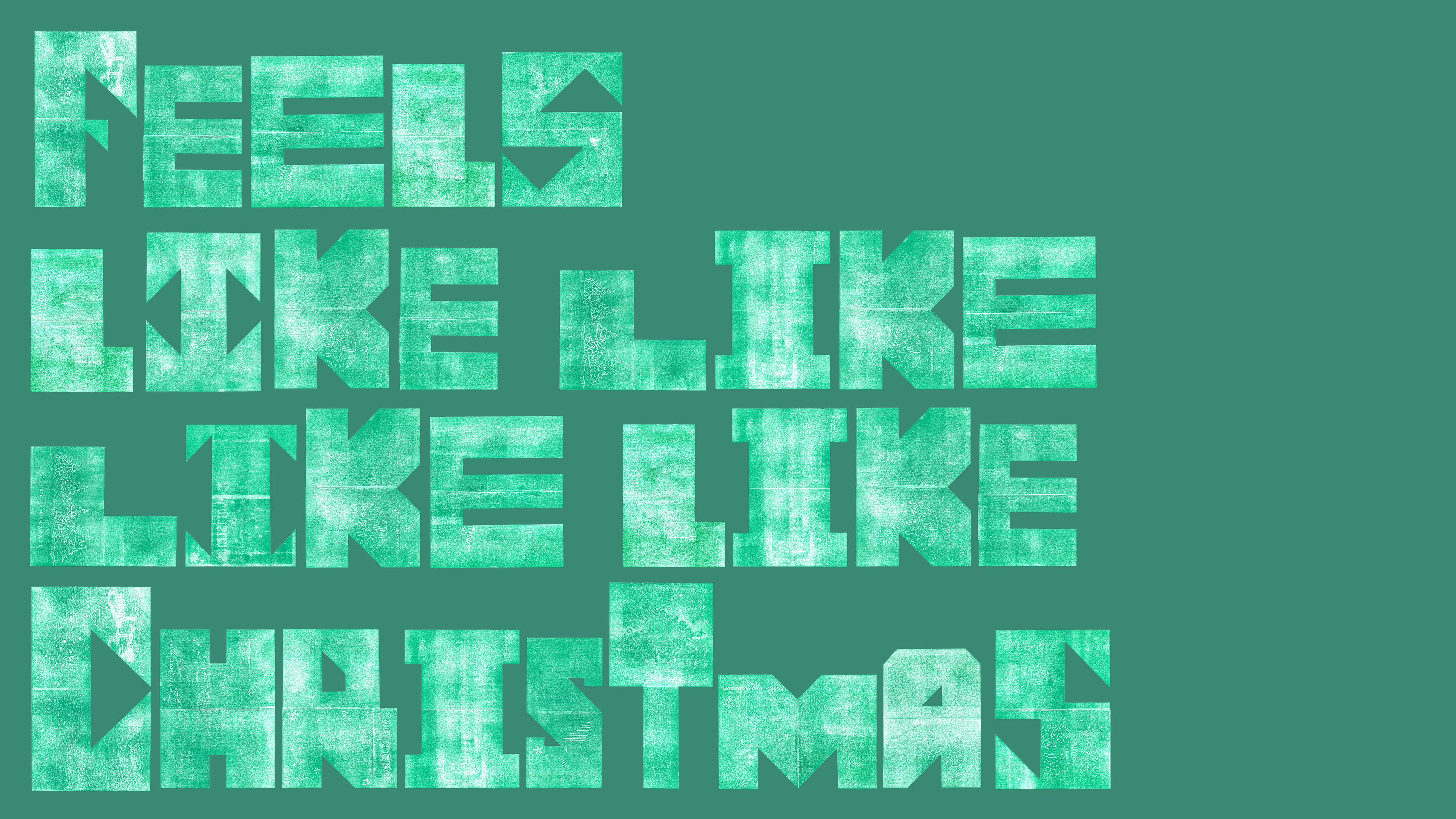
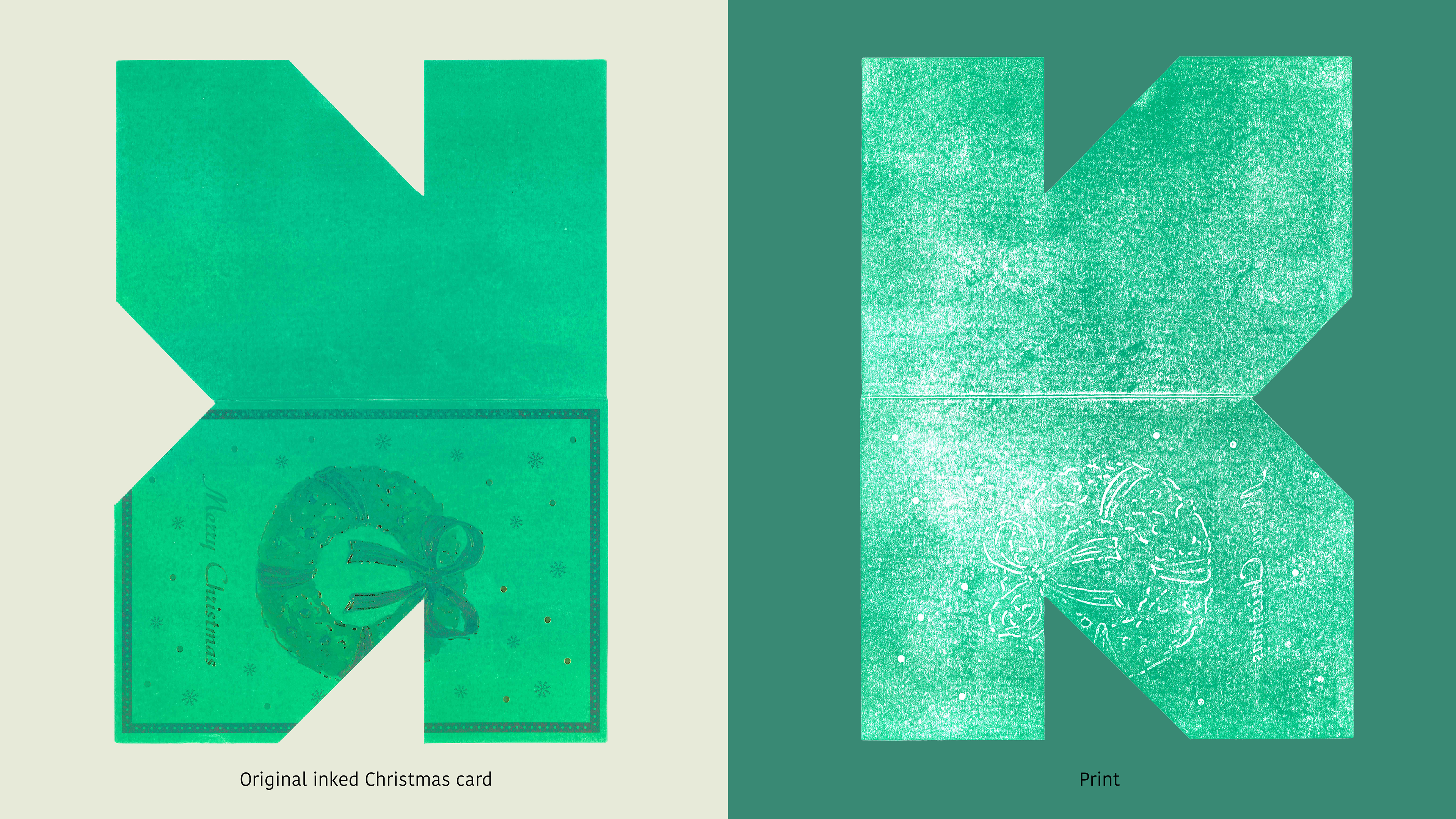
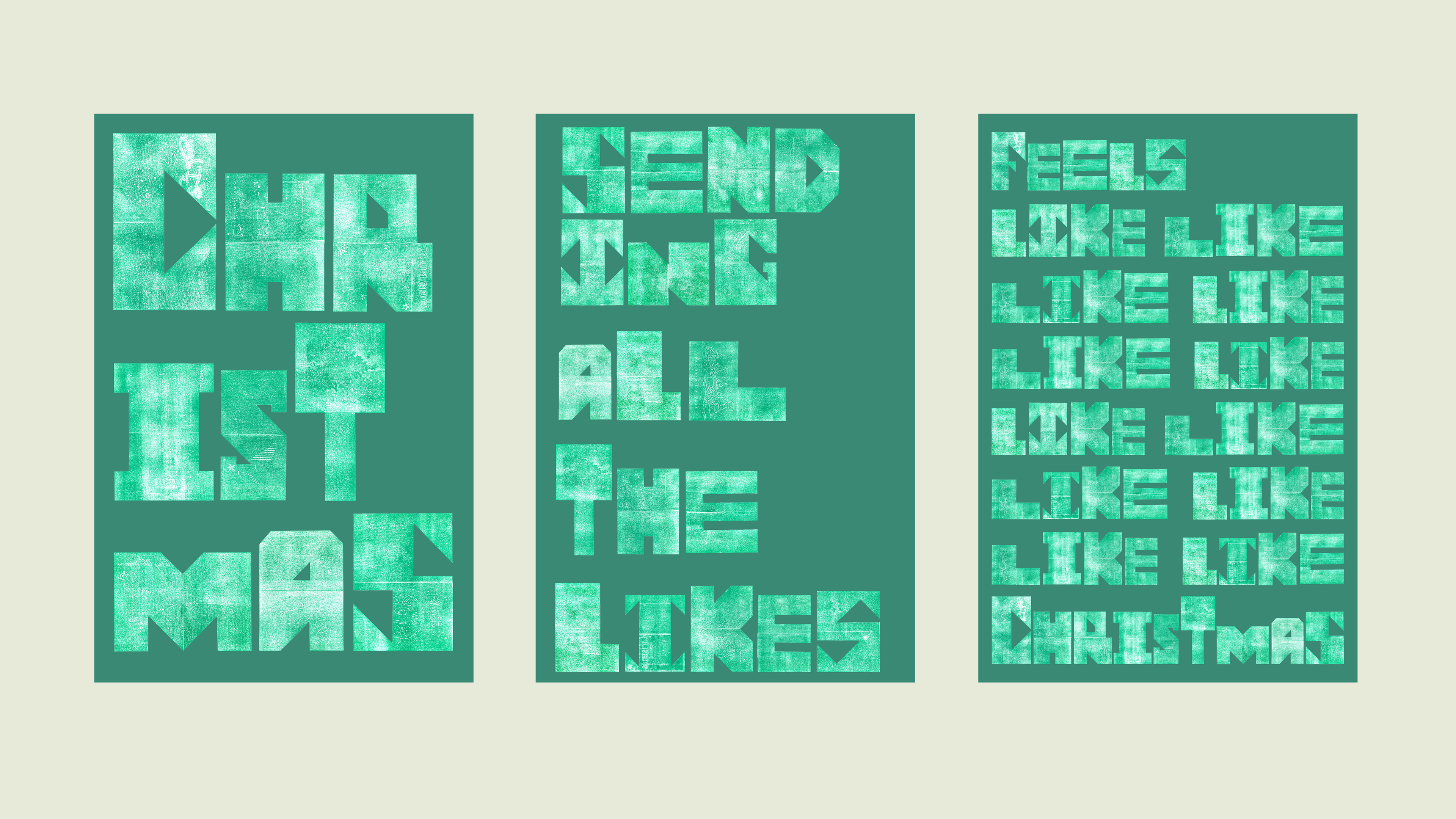
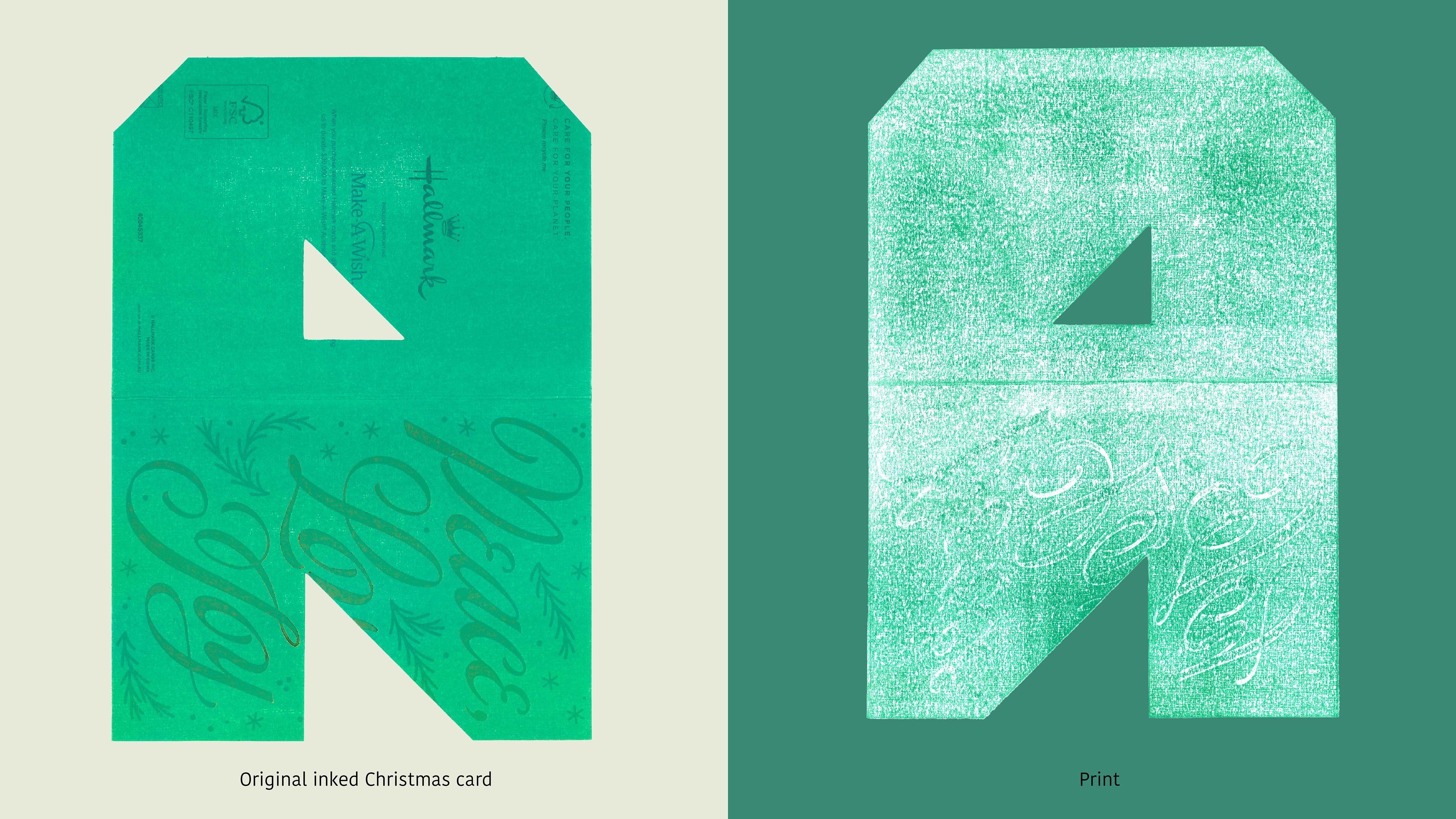
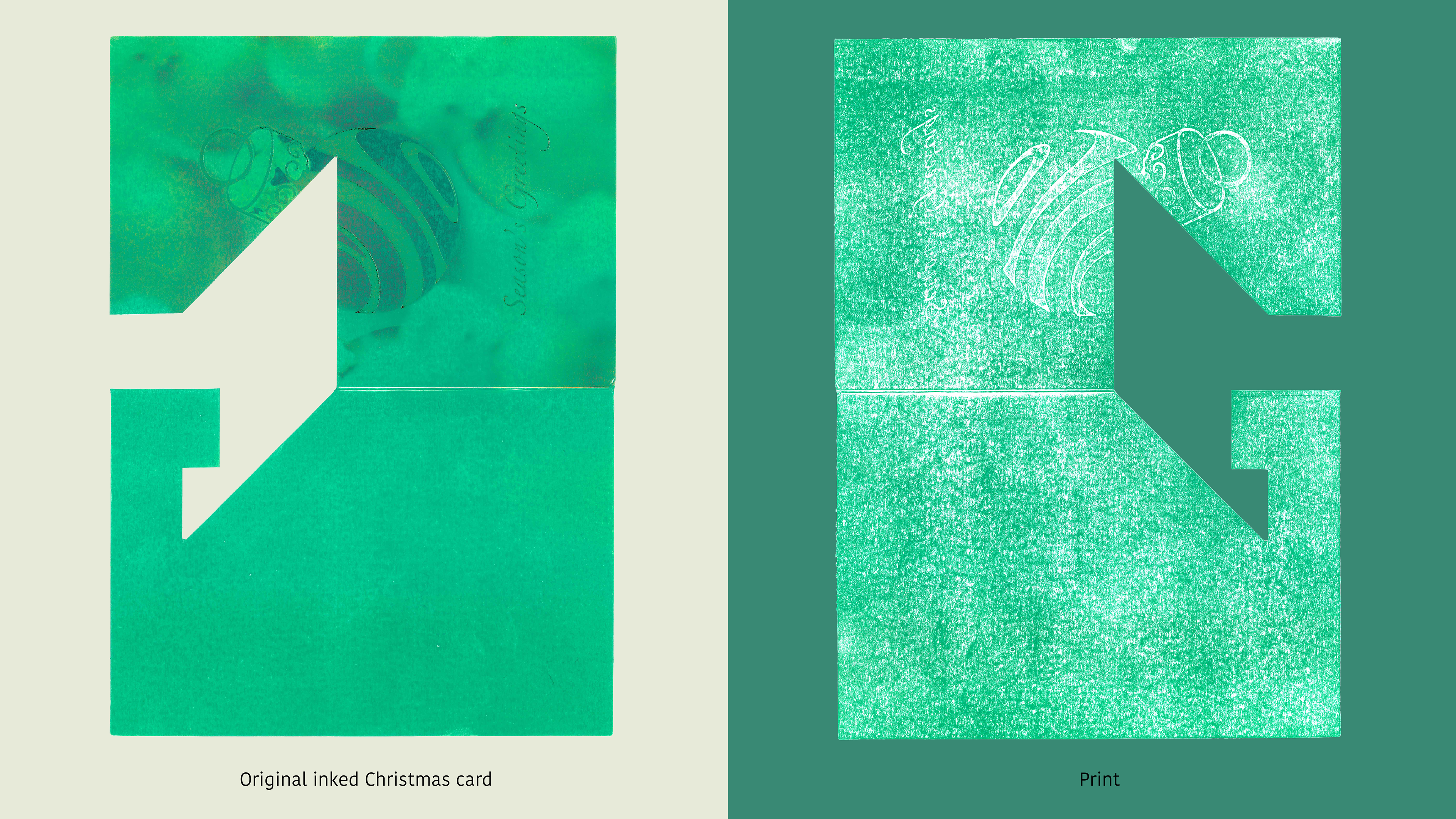
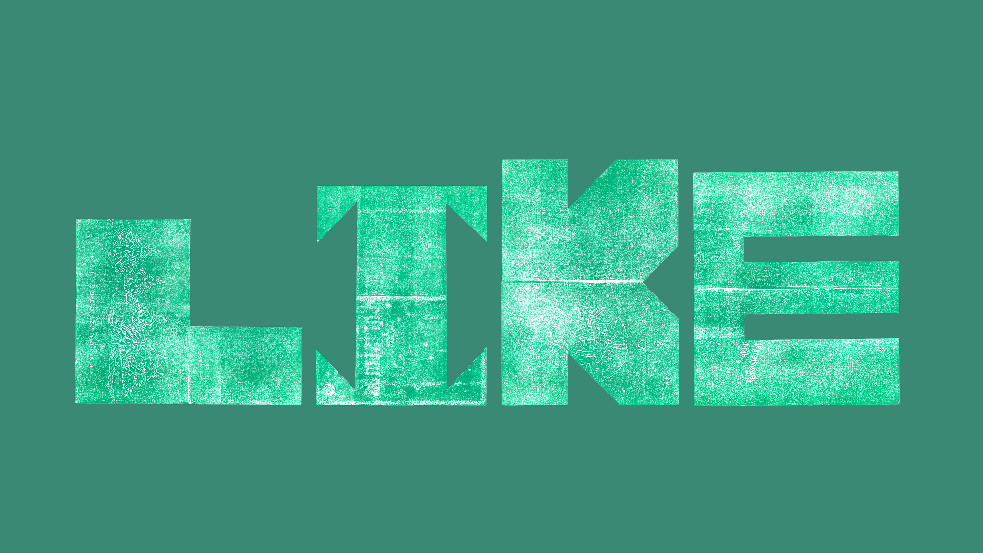
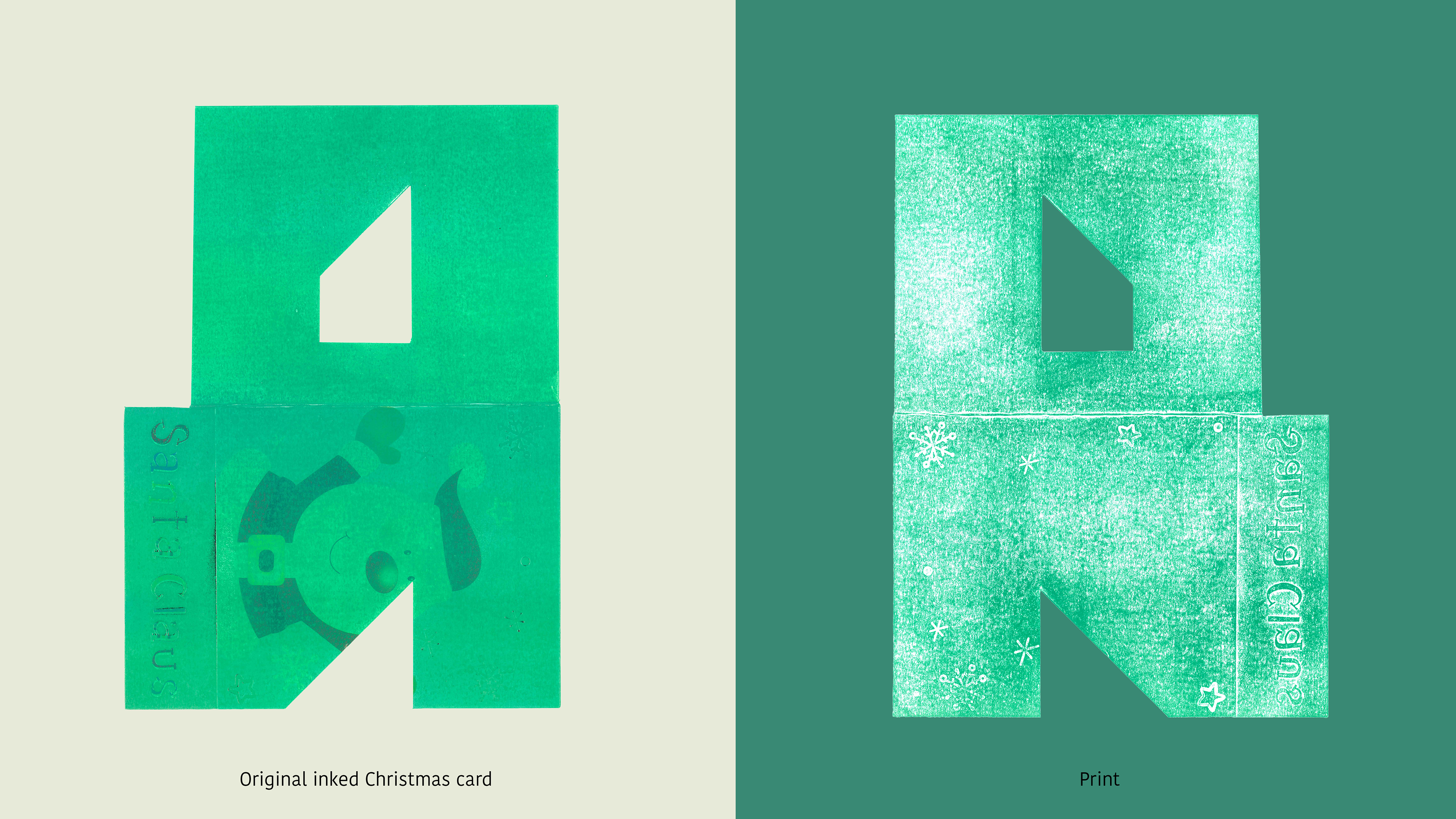
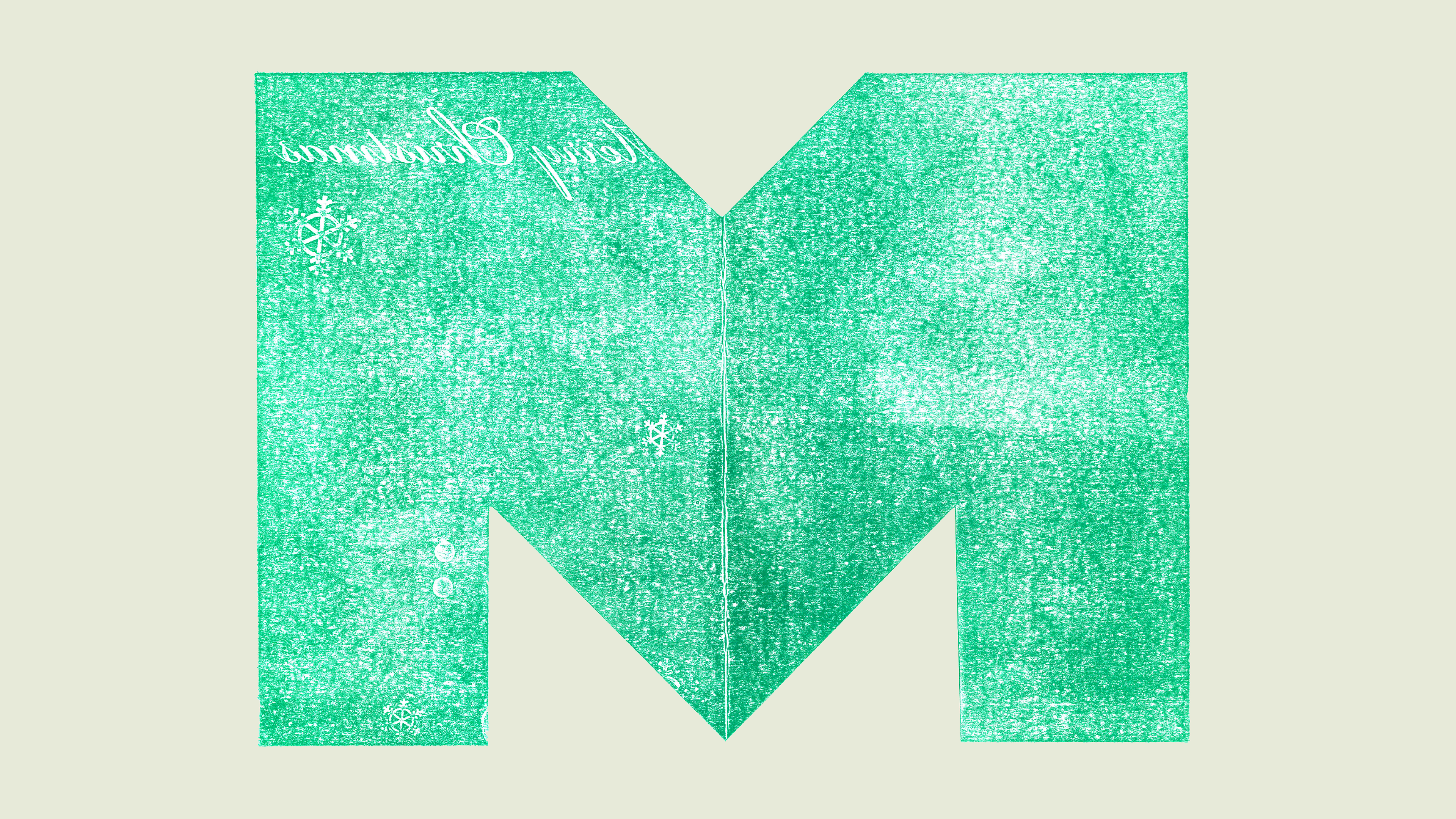
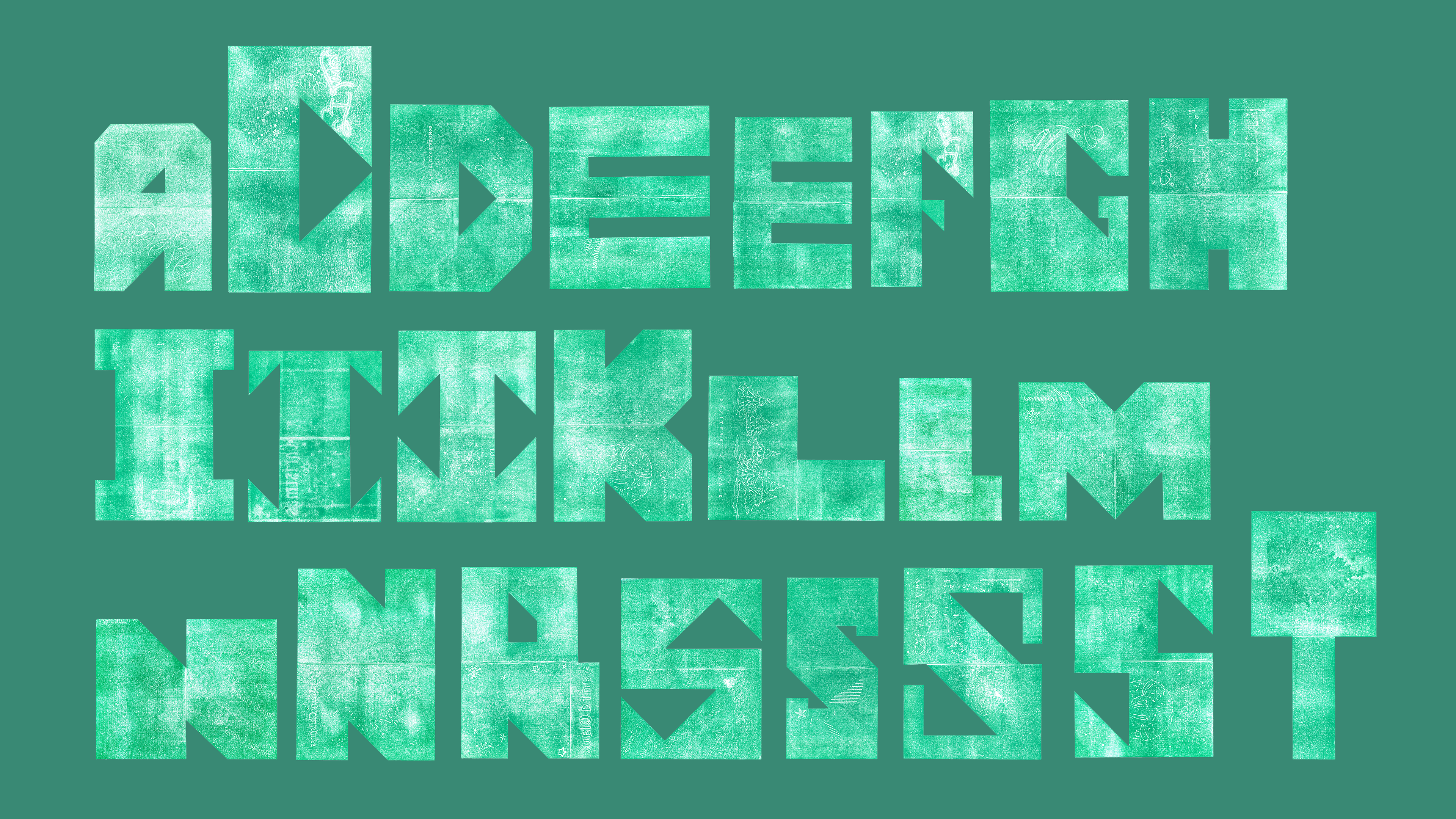
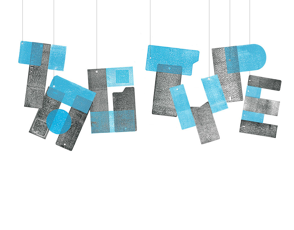
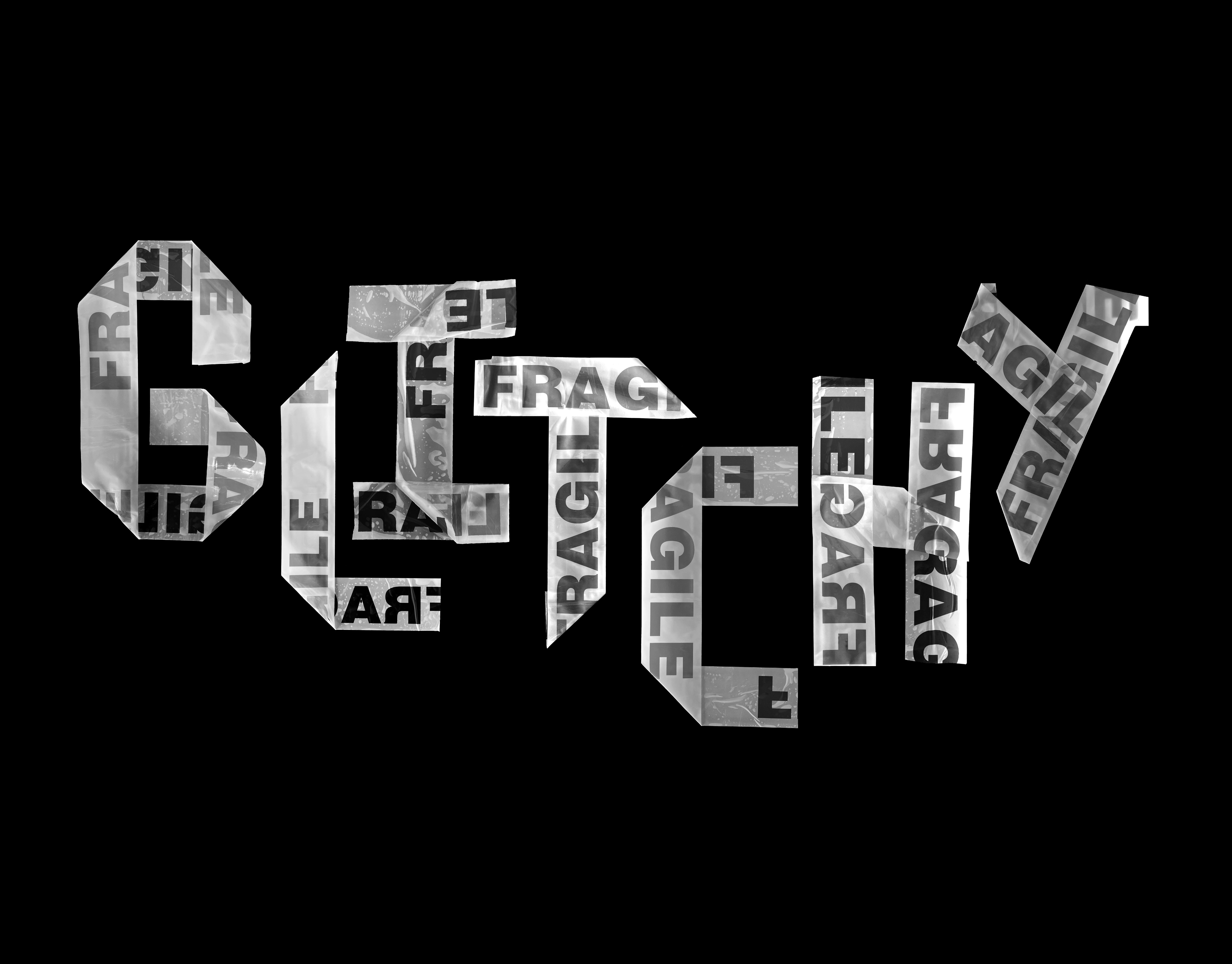
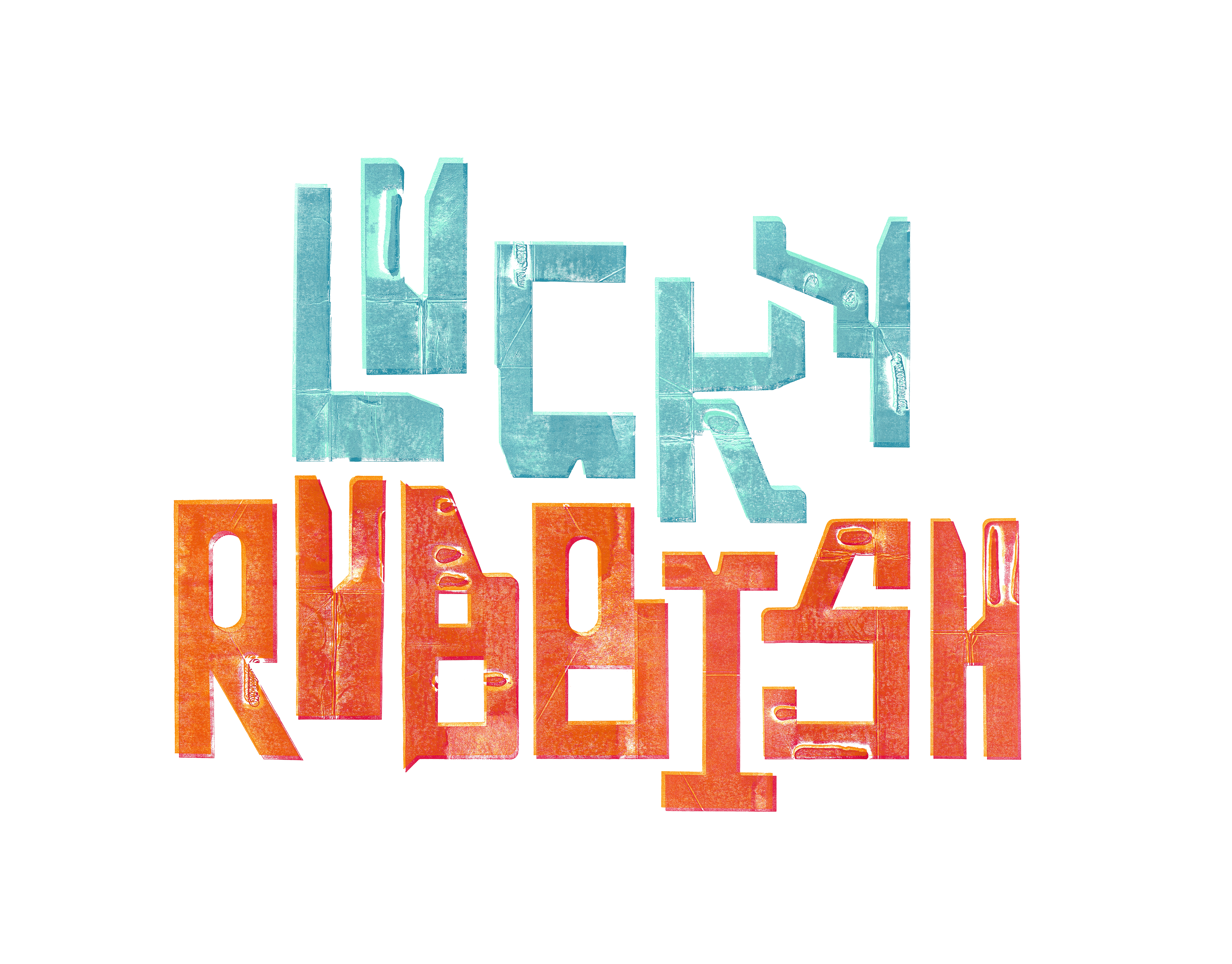
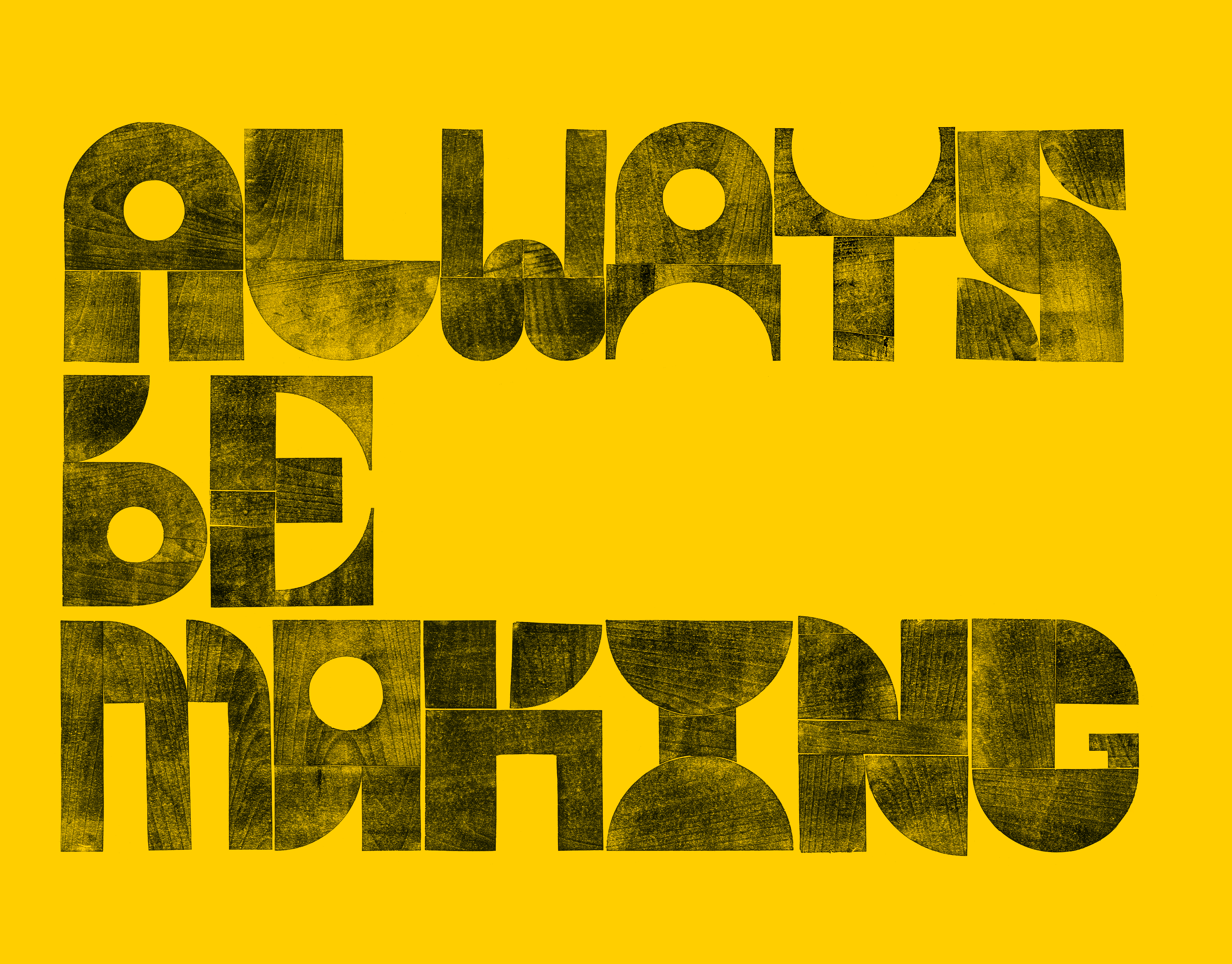
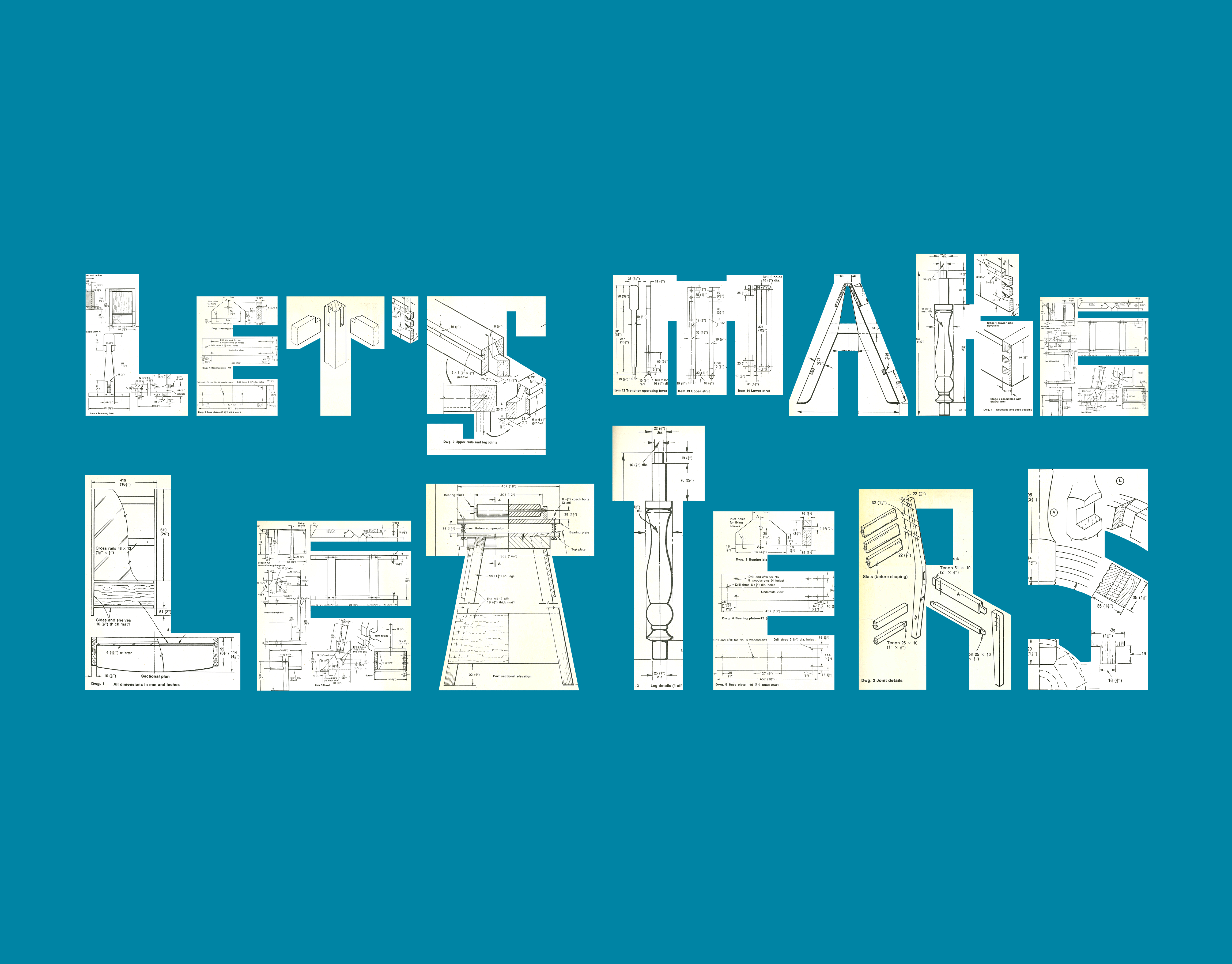
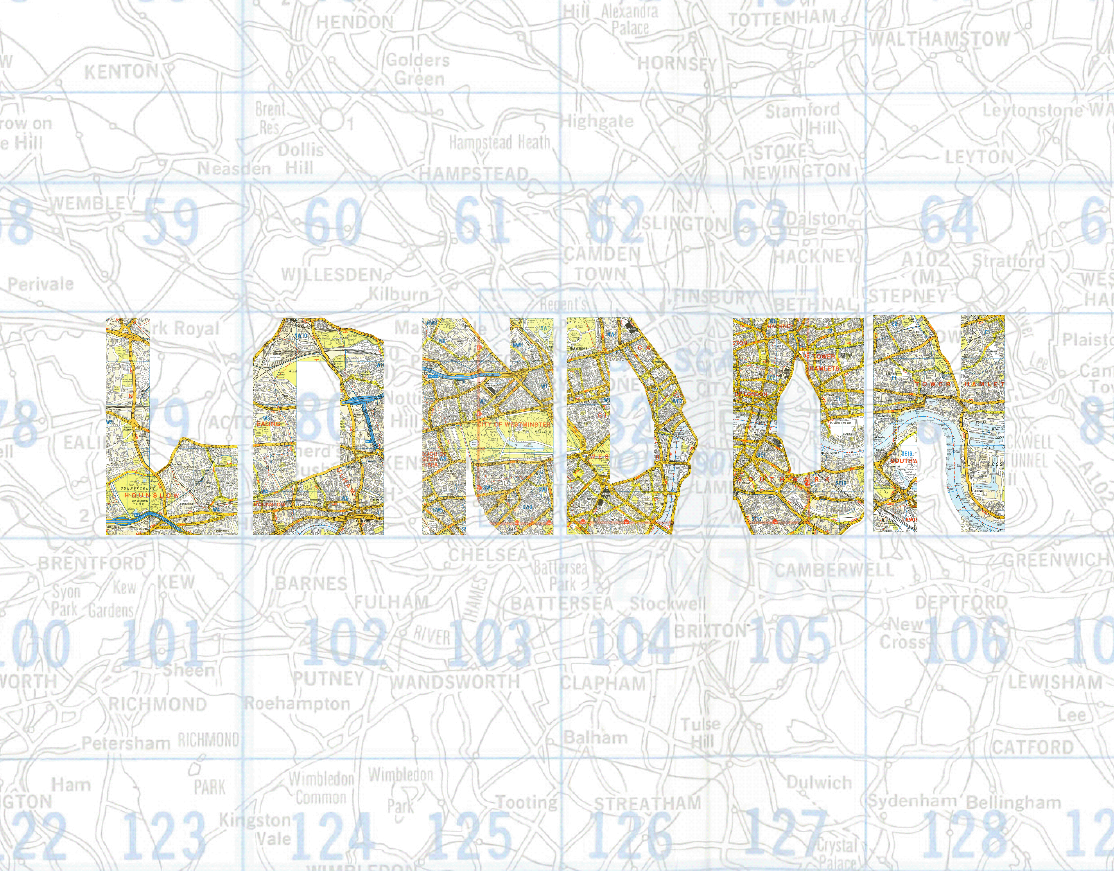
Typography meets tactile storytelling. In this project, I reimagined old Christmas cards by cutting out their counter-spaces to reveal a custom, blocky typeface. I developed this font with a heavy weight to stay true to the card form, then inked and printed them like letterpress blocks. The result is a set of letters that carries the DNA of the original cards, complete with unexpected embossed details and print-room randomness, reimagining "found" print in a new, festive light.